MACD Divergence Analysis
MACD Histogram Divergence Analysis
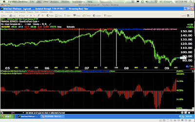
MACD is one of the most powerful divergence indicators you can throw on a chart. Price charts are almost fractal in nature, meaning price patterns you see on a 1 miute chart, can be seen on a 1 day, 5 day or monthly chart. The same is true for the indicators we use on them. I always like to look at the long term picture first, then you can break down your analysis to the timeframe in which you prefer to trade.Here is a exponential MACD Histogram in red with typical settings of 12/26/9, except we are looking at a weekly chart of the SPY (S&P 500 ETF). While many traders use MACD crossovers as signals to enter and exit a trade, I prefer to use the indicator as a confirmation/divergence tool.The idea is a stock making higher highs and higher lows, or better known as an uptrend, should see the MACD above the zero line increasing in size with each successive high. Don’t worry about the moves below zero, that happens. If you notice, the S&P uptrend from the 3rd quarter of 2005 to the 4th period of 2006, the indicator is growing larger on each successive high in price. However, that 2006 Q4 reading was the highest of the MACD trend. This was confirmation of the uptrend.Now for the divergence, notice 2Q of 2007 sees a lower MACD reading above the zero line, even though price is higher. Then we get one more reading at October of 2007 which is even lower. I like at least 2 divergences like this, sometimes 3 and then there is usually a clear reversal in trend. This October divergence called the market top and we went down from there. As a long term investor, it was time to cash in. As a trader, it was time to look at the shorter time frames for shorting opportunities.

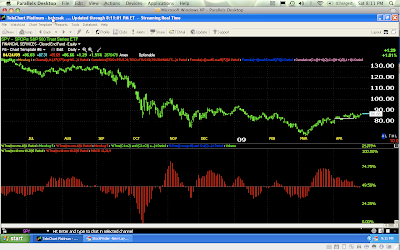
Looking at the same indicator at present, on a one day chart of the SPY, we reverse the whole process in looking for positive divergences that may sgnal a change in trend. This time we are paying attention to what is happening below zero. Note the deep reading during October of 2008, which confirmed the downtrend as it made deeper lows. However, if you drew a trendline on price, you’d have a down trend, if you drew a trendline on MACD from October to the market lows of March 2009, you’d have an uptrend and a positive divergence. Time to start watching for a change in trend and that is where the March Bear market rally kicked off.

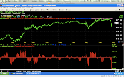
Finally we’ll look at this last Friday (April 24) on a 1 minute chart-still the same MACD settings as all the other charts. Notice how Thursday toward the end of the day the Histogram (above 0) was growing larger, signalling a confirmed uptrend? If you drew a trend line from then to about 2 pm on Friday, you’ll see a downtrend in MACD and an uptrend in price, shortly after that we got a major dip in price. After 2pm we saw another strong reading from MACD signalling a new trend and if we got another reading even higher, we could have some level of confidence in the uptrend. However that wasn’t the case, again the Histogram declined and we saw another late day sell-off. This was a warning signal that you should be taking profits and not entering new longs.

Quite often the shorter time frames will have a lot more signals as we see here. Don’t be afraid to play with the settings. I often double and even quadruple the MACD settings to look at longer term views and get more consistent signals.
If you want to really get into the knitty-gritty of MACD, click this link to INO TV, they offer you 4 free video seminars and the one I’ll recommend is Construction & Application of the MACD Indicator by Gerald Appel, the man who created the indicator. He’s also written 12 books on trading and technical analysis. He also is the president of Signalert Corporation, an investment advisory firm that manages approximately $280 million in capital. Get it straight from the man, a 90 minute seminar with a 45 page workbook (PDF) included and clicking this link will get you this video for FREE!
Email me with any questions, enjoy!


