UNDERSTANDING 3C: PART 3


In this chapter we’ll take a look at the main function of a 3C signal, a divergence. There are 6 possibilities for a 3C trend:
1) Confirming an uptrend, which s marked by a green arrow. For this to happen, price has to make higher highs and lows and 3C should do the same generally, it doesn’t have to mirror every move that price makes, but should be moving in the same direction.
2) Confirming a downtrend, also marked with a green arrow. Price makes lower lows and lower highs in a downtrend, 3C should be heading in the same direction as price. Confirmation of trend is usually found right after a divergence changes a trend from one direction to the next and usually represents smart money moving price in the direction of their position (up for long or accumulated positions and down for short or distribution). This is the stage where they move price past their average position or break even price.
3) Relative Positive Divergence, this is when you compare two relative points, the second point should see price lower then the first or even equal to the first, but 3C should be higher the 3C was at the first point, this can show stage 1 accumulation has started, it can also call for price to consolidate (go sideways instead of down) or to bounce (move up briefly instead of going down).
4) Relative Negative Divergence, this happens in an uptrend or at two relative points that are equal in price, but 3C is lower. This shows distribution, but can also mark a consolidation of price in an uptrend or a pullback in price.
5) Leading Positive Divergence, this is most often seen in a base or when price is heading lower and sometimes even when price is moving up. A Leading Positive Divergence leads price, often breaking away from price and headed in the opposite direction, sometimes reaching new highs for the indicator on the chart. A Leading Divergence is always stronger then a Relative divergence and it mostly has to do with the amplitude of the indicator or the momentum in contradicting price.
6) Leading Negative Divergence, most often seen during an uptrend in price or a lateral correction in price after a strong uptrend. This is very negative and 3C will break lower and continue to move lower, even while price may be moving higher or sideways.
Some Relative divergences can be very strong if they cover a large area of time, say between two uptrends or more. A leading divergence however, shows the sharpest underlying action in 3C.
Here are some examples, first without the arrows so you can try to spot the 3C signals and then the same chart with the arrows pointing out the signals.
These are all 15 min charts of the QQQ.

This is early August when prices finally broke that nasty downtrend in the market. First we’ll look at a strong Relative Positive Divergence between point 1 and point 2. Notice where both price and 3C are at both points. You should see price made a lower low at point 2, but 3C made a higher high. Not to confuse you because this is a strong relative divergence, but it would still be a relative positive divergence if 3C made a higher low at point 2. Between point 2 and point 3 both price and 3C have moved up, this is confirming the uptrend. Between point 3 and point 4 both price and 3C moved up together, again, confirming the uptrend. However, between point 4 and point 5, price makes a higher high, 3C makes a lower move, this is a Relative Negative Divergence because between two relative points, price is moving up and 3C is moving down. At point 5 and 6 price is about equal, maybe a tiny bit higher at point 6, yet 3C continues moving down, it s now entering a Leading Negative Divergence. The same thing happens between point 6 and 7 and after that price reverses to the downside. This is a complete cycle, we went from accumulation or a base to mark up, then distribution started while price still moved higher as they almost always sell in to strength and finally we saw heavy distribution at the top when prices where more lateral which is stage 3. The distribution here was the strongest and can include short selling by Wall Street, then price fell and we entered the final stage, 4, decline.
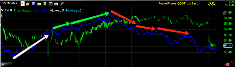
This chart is the same as above, the white arrow marks accumulation, the green arrows mark confirmation of the uptrend, the first red arrow is a Relative Negative Divergence and the second and third red arrows are Leading Negative Divergences, which should be displayed in a red box-my mistake.

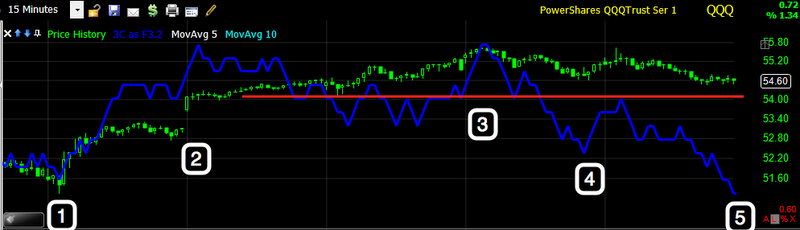
This Chart is from August Options Expiration, the move down was the Thursday decline. This is an example of a strong Relative divergence because it happens over a larger time period. Look at how high 3C is at point 1 and how much lower price is at point 1 then at point 2. The fact 3C didn’t move higher at point 2 with price, makes this a strong Relative Negative Divergence, it was briefly followed by a Negative Leading Divergence before the reversal down.

Here is the same chart as above, note 3C is nearly at the same level between the 2 points, but if you drew a line between the two points covering price, you would see price moving higher, the fact 3C did not move higher shows us distribution and a strong Relative Negative Divergence.
Here we start with point 1 and 2 which shows 3C and price moving higher together, this is good for the uptrend and is confirmation of it’s strength thus far. We expect the trend to move higher until we get a different signal. At point 2 and 3, we get a different signal; price has moved higher, but 3C is nearly at the same level, it certainly hasn’t kept up with price so we have a Negative Relative Divergence, if you look between point 2 and 3 you will see an earlier Negative Divergence. Now look at the red trendline on price. Note that price is higher to the right of the trenedline then toward the left, however, 3C has made a new low at point 4, this is the start of a Leading Negative Divergence, by point 5 price is equal to point 4, but 3C is much lower. This is heavy distribution during a price stage 3 top.

This is the same chart as above, you can see confirmation, a relative negative divergence and finally the leading negative divergence. The yellow arrow points out how low 3C actually is, almost as low as 3C at the far left of the chart, this is major distribution and price fell right after.
Divergences can go on for some time, we can see the underlying action of what Wall Street is doing, but we don’t know their motivation, how long they intend to accumulate. The longer they accumulate, the bigger the position is and the longer the coming uptrend will last. We can get some idea of how powerful a trend will be by how long the accumulation or distribution period lasts and what kind of divergences are present and how deep they go. 3C has no numerical value like some indicators, it’s all about comparing it to price at different points. The more timeframes you can find in confirmation of each other, generally speaking, the closer you are to a change in price trend. That’s why it s called 3C, “Compare, compare, compare”, the more observations that give the same signal, the greater the probabilities are in your favor.
One last word, divergences should be clear, you shouldn’t have to break out a ruler and measure them, it does take some time to get use to spotting them, but if they don’t standout, then they should be ignored. We are looking for strong signals that institutional money is in play, they are not always in play all the time in every stock.