Understanding MACD and MACD Histograms
MACD is the acronym for “Moving Average Convergence Divergence” Here’s a typical MACD chart with a standard setting of 12/26/9 and set to exponential. The 12 day moving average in the price window represents a fast moving average of price. The 26ema is the slow moving average of price. MACD is interesting because it is both an oscillator and a trending indicator. It relies on lagging indicators (moving average of price), yet has predictive power.
In the lower window we have a blue line which represents the actual MACD indicator (more on that in a moment) and a red line which is our “9” in the 12/26/9 setting and is a 9-day exponential moving average of the actual MACD indicator. For now, ignore the blue bars in the lower window.
MACD measures the difference between the two moving averages of price. The middle line is the “0” line; when the 12ema of price crosses above the 26 ema of price our MACD indicator in the bottom window (blue) will cross above the zero line simultaneously. When the difference between the two moving averages of price is widening, MACD indicator line (blue in the bottom window) will rise.
When MACD is above the zero line and is rising, that means the rate of change of the shorter moving average of price is rising faster than the rate of change for the longer 26 ema of price and the gap between the two is becoming wider indicating bullish momentum. The same is true in reverse, when MACD is below the zero line and the gap is widening-this indicates bearish downside momentum-when the two are close you may see crossovers of MACD and it’s 9 day ema of MACD, whether above or below the zero line. MACD is measuring momentum, the 9 day average of MACD is simply providing a signal line when that momentum shifts and the 12 day of price looses it’s momentum you may see these crossovers.
Here is a shot of Stockfinder–We have been looking at the actual MACD indicator offered in TeleChart. What I did was to create the two moving averages of price, then ask Stockfinder to compute the difference between the two and it gave me the exact same line as the MACD line in TeleChart-both blue. Then I added a 9 day ema to the MACD line I created and you can see we have the exact same indicator. If you look to the right carefully, you will see zero and the crossovers of zero at the exact same time.
Now I’ve gone 1 step further and asked Stockfinder to plot the difference between my MACD line and its moving average, I converted the line to bars and presto! A self-made MACD Histogram. I hope this helps you understand how this indicator works.
Short term traders may use the crossover of MACD and it’s 9 day ema as trade signals, despite being above or below the zero line. For example, on 3/12/09 MACD was below the zero line, but had crossed above the signal line (9 day ema of MACD lower window-red). This crossover, despite being below the zero line, gave the short term trader a buy signal and it didn’t cross under until 4/22/09-nearly a 12% gain. The MACD signal recognized the change in momentum and gave a crossover buy signal 10 days before the moving averages of price. However, the MACD was then plagued by a few whipsaw crossovers that would not have yielded profitable trades.
If the longer term trader were to purchase the SPY on a crossover of MACD above the zero line and stay with the trade until it crossed below the zero line, the trade would have made approximately 11.5%. However, here’s where the predictive power of MACD comes into play. A strong trend should see the same strong trend in MACD and each of the crossovers or pivot points above the zero line would make higher highs in a strong price trend. The first lower high gives us what is called a negative divergence, which is to say that MACD is signaling fading momentum, even while price may move higher. So if the longer term trader used the same entry signal, a cross above the zero line and used the first cross down showing a negative divergence and got out of the trade there, that trader would have netted 15.25%-a bit better than the first example. The same application in reverse could be used for a short sale.
A short term trader recognizing the cross down of the first negative divergence around 6/12/09-6/15/09 could have gone short and exited upon the first sign of a crossover of MACD above the signal line around 7/14/09 and could have made a quick 5%-using an ULTRA ETF that would have been nearly 10%.
Enter the Histogram. A popular way of looking at MACD is by using the blue bars in the bottom window, the MACD Histogram. This indicator does not care whether the MACD indicator line is above or below zero, the Histogram simply measures the difference between the MACD indicator and its 9 day ema. When MACD is above it’s ema, the Histogram will be above zero-whether MACD is above or below the zero line. The wider the difference between MACD and it’s moving average (greater momentum) the more extreme the bars-higher or lower.
Predictive Power! One of the most effective ways of looking at nearly every indicator out there (nearly) is to look for divergences and MACD divergences are one of the most reliable signals available in Technical Analysis. You have two things that can happen between price and an indicator like MACD-1) Confirmation; this means as price makes higher highs, MACD makes higher highs and this signals a strong, healthy trend. 2) Is Divergence and this is when price and the indicators go their separate ways. For example, price may make higher highs, while the highs in MACD are consecutively lower; this is a negative divergence and tells you that despite rising prices, the trend has lost its vitality and may be near a reversal. A common practice is to use the MACD Histogram for this purpose and 2 or 3 consecutive divergences in price gives you a strong likelihood that prices are ready to reverse.
Back to our TeleChart MACD-look at the strong bars at the start of the new trend, the next top in MACD comes amid advancing prices around May 8th; this is our first warning. The next top in MACD during the first week of June, despite rising prices, is even lower than the previous-this is what I consider to be 2 divergent tops and a signal of a reversal. By the second week of June, the SPY experienced a nearly 1 month decline in prices.
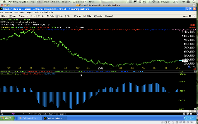
Here’s a chart of Oil and not just any chart this is the top of the huge oil bull market. As you can see, September to March 2008, everything was more or less ok, the peaks in MACD were growing, after that trouble was signalled on every peak after that, each got lower and lower creating a negative divergence as price was rising. During July, the downside peaks were growing signaling momentum to the downside. You can see as MACD lost it’s momentum, so did price and started moving sideways. We even saw the start of a rally in oil.
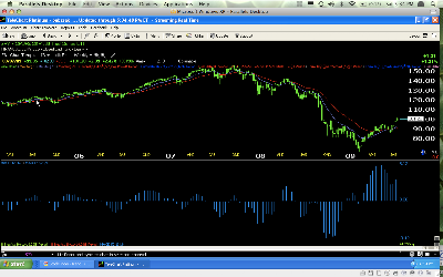
In conclusion, MACD can be a very powerful tool for all traders and all timeframes. The weekly chart of the SPY below was right on track in calling the trend.
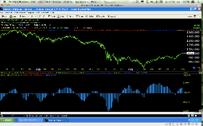
Don’t be afraid to experiment, I typically use a very long MACD which eliminates many whipsaws or false signals. This chart of the SPY and MACD Histogram uses a setting of 52/104/9 and you can see the downside momentum and the divergence right at the March low that kicked off the rally. You can also see fading momentum in the current (what I believe to be) Bear market rally as if forms a Broadening Top.
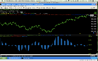
Using the same settings, applied to a 60 minute chart, you can see the positive divergence at the July lows and a string of negative divergences running throughout August leading me to believe we are close to a reversal.
To use the charts I use, visit Worden/TeleChart and please tell them I sent you if you sign up. Or visit Stockfinder also brought to you by Worden, I’m an affiliate for both.
For more intensive information, take a look at this link with over 150 video seminars, typically 90 minutes with work books included-you can watch 4 for free on me using this link.
As always, email


