Weekend Market Update – A Dollar Dilemma?
The Week
On the week the Dow (+3.8%) was the best of the major averages, outperforming the benchmark S&P +2.45%. NASDAQ 100 (+2.14%) performance was similar to the S&P, but NASDAQ’s participation was the weakest with the equal weighted index nearly half the gain at +1.2%. Small Caps +5.98% were best by far. They benefited the most from a very large short squeeze that ran throughout the week.
One of the S&P’s defining characteristics this past week was very flat, range bound trade in the cash session. I kept saying it felt like the market was waiting for something.
dilemn
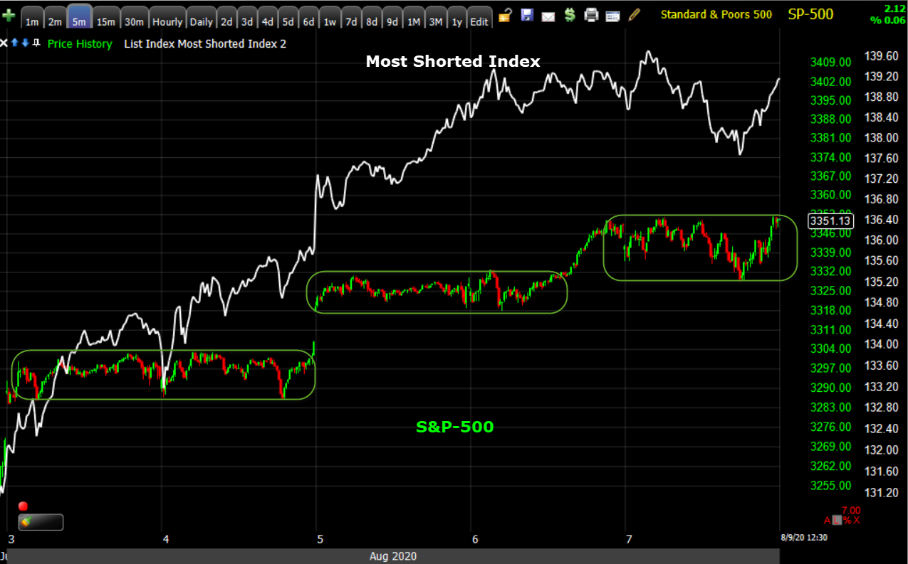 SP-500 (5m last week) flat ranges with most gains coming from overnight gaps, but note the most shorted index (white) tearing higher all week as shorts were squeezed.
If we replace the S&P with small caps you can see small caps’ performance was due to the squeeze.
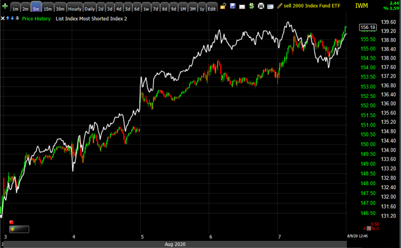 IWM (5m last week) and Most Shorted Index tracking nearly identical this past week.
The best performing S&P sectors or groups were Energy +3.2%, Financials +3.4% led by the Banks – KBW Bank Index +3.9% and Regional Banks +5.5% which contributed to small caps outperformance. Also Industrials +4.74% led by Dow Transports +5.8%, contributing to the Dow’s outperformance, and the Retail sector +7.16%.
No sectors closed lower for the week, but the defensive or defensively oriented sectors that led the week before, were the laggards – Consumer Staples +1.3%, Utilities +1.1%, Health Care +0.8% and Real Estate +0.65%. This fits with the slight underperformance of bonds with the 10-year yield rising modestly by +2.5 basis points on the week.
Mega-cap Tech’s performance was mixed, which has been the case every day since they reported earnings just over a week ago. On the week – FB +5.8%, AMZN +0.1%, AAPL +4.57%, GOOG +0.78%, MSFT +3.46%. The only day they pulled together as a group was Thursday, and that happens to be the only day the S&P made a significant advance in the cash session.
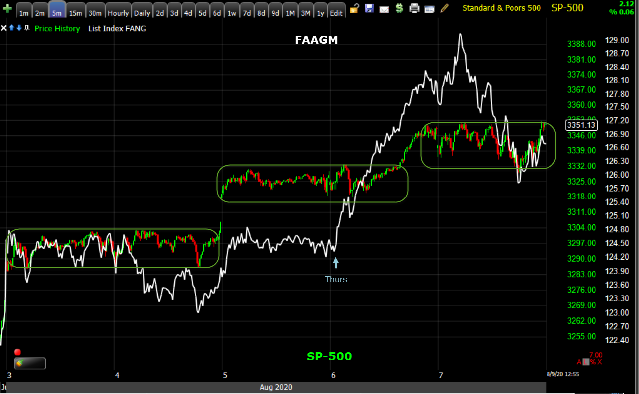
SP-500 (5m last week) and index of FB, AAPL, AMZN GOOG and MSFT. Notice S&P traded above the 2-day range Thursday afternoon as the 5 mega-caps gained together, something they have not been doing.
I think there’s a probability NASDAQ has been undergoing distribution in the $11,000 area since the July 13th Key Reversal Day, and that may also explain the mega-caps mixed trade from day-to-day since reporting earnings.
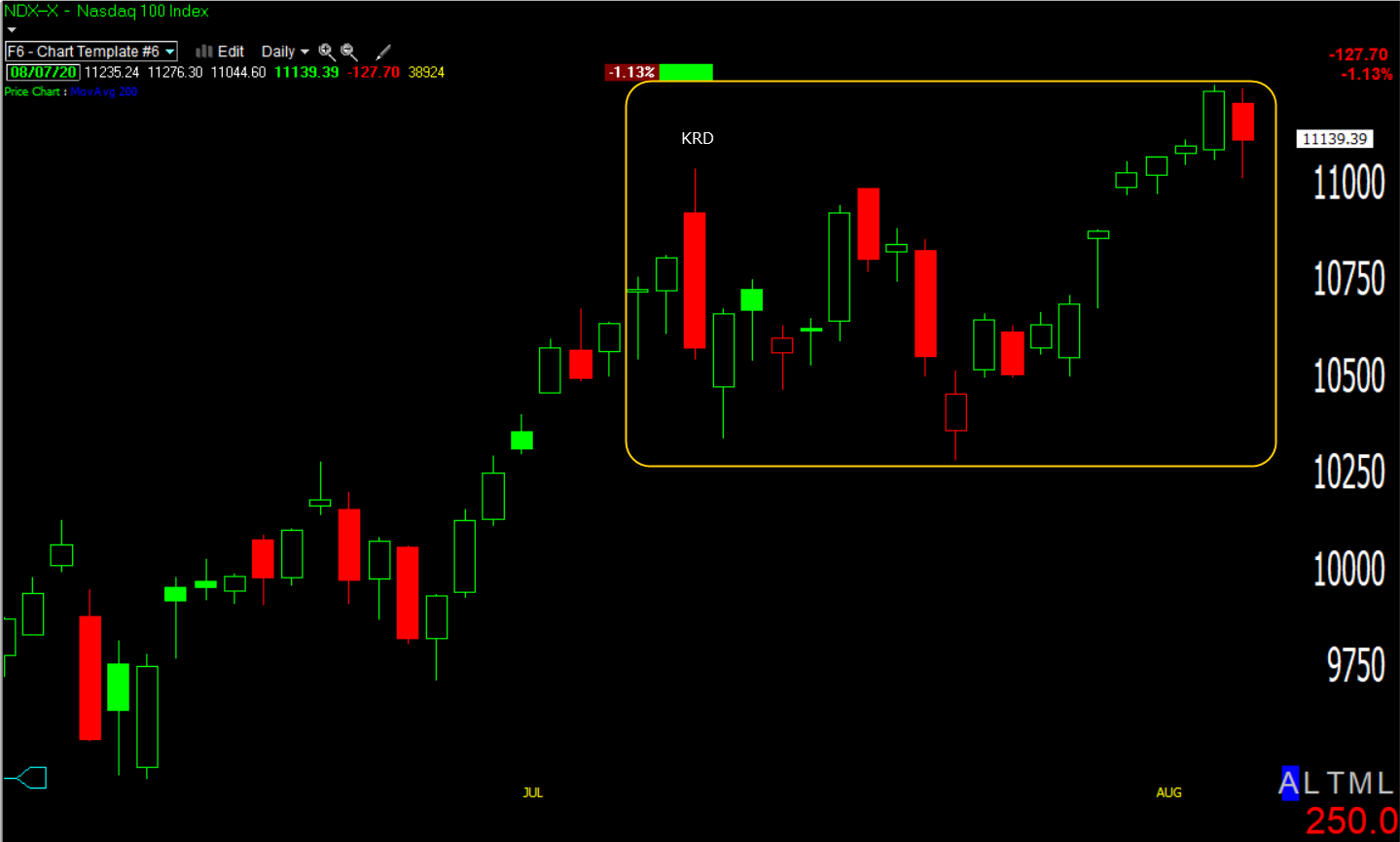 NASDAQ 100 (daily) KRD=Key Reversal Day. Since then each time NASDAQ rallies back to the 11k area, it sees some aggressive selling. As a reminder the July 13th Key Reversal Day was the most violent for the NASDAQ since March 7th, 2000, about 3 weeks before the NASDAQ topped and entered a 2.5 year bear market and lost-83%.
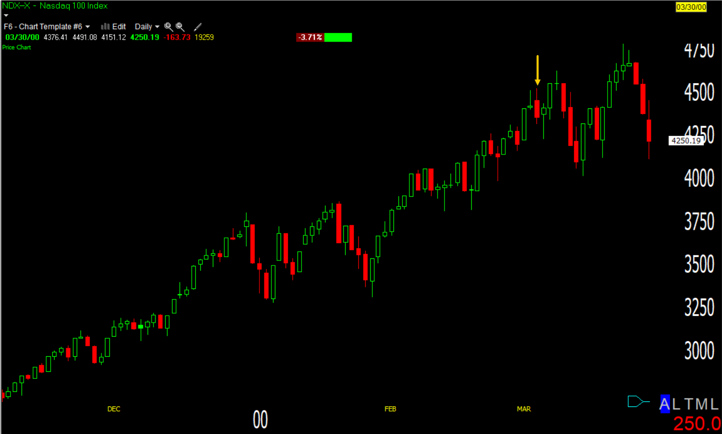 NASDAQ 100 (daily rolled back to the 2000 Dot.Com bubble top). It turned out that the Key Reversal Day in early March was marking the process of distribution in which the NASDAQ gained another 7% (to a new record high) over the next 3 weeks before topping.
The goal of distribution is to unload what are huge positions, but to do it in small pieces and into rising prices. If the whole position was dumped at once it would crash the market. Distribution seeks to sell to the greater fool at the best prices possible. This may explain mega-caps mixed performance.
Notice how NASDAQ has traded since the Key Reversal Day…
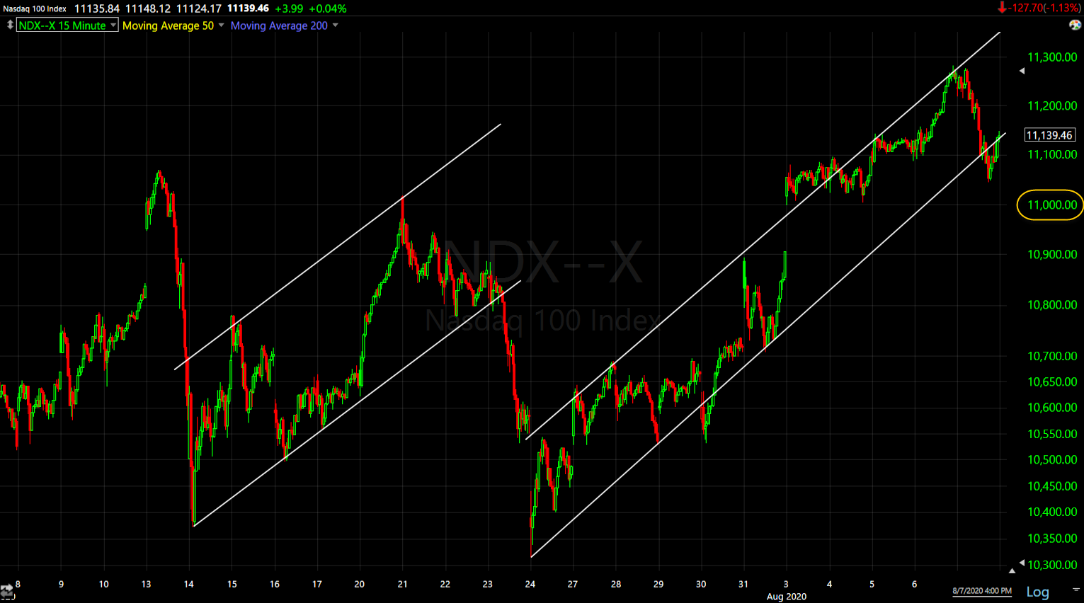 NASDAQ 100 (15m) rises in a channel and sees selling around $11k, then is ramped back up again an the process repeats.
Friday we got a glimpse of more aggressive selling in NASDAQ above $11k….
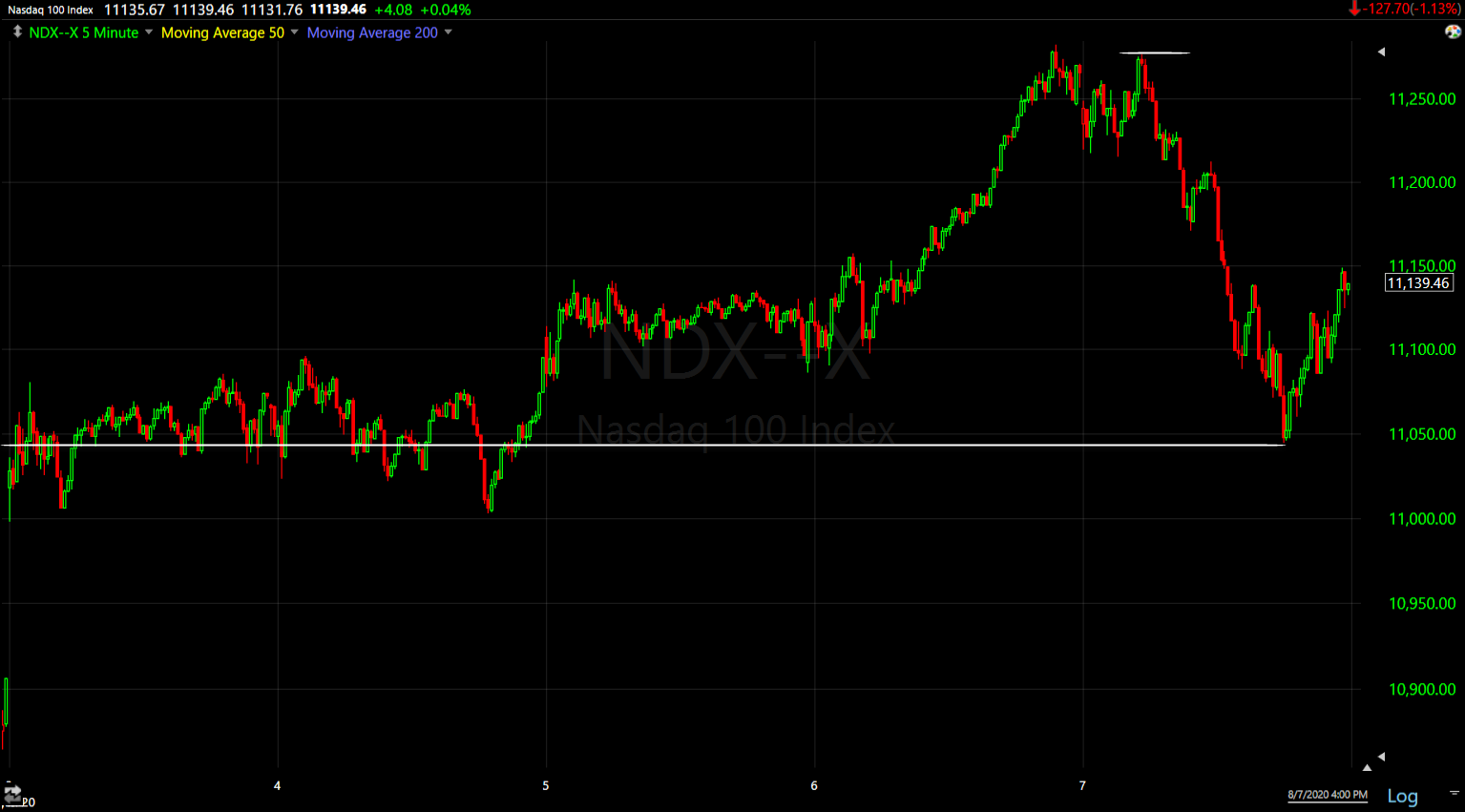
NASDAQ 100 (5m) on the week. Over a period of a couple of hours NASDAQ retraced all of Thursday’s strong gains and almost the entirety of the week’s cash session.
Bad Breadth
The rallies up to the $11k area have been increasingly dependent on the 5 mega-caps as seen on SPX’s chart Thursday. The top-5 S&P stocks by market capitalization (AAPL, AMZN, GOOG, FB, and MSFT) make up the same amount of the S&P 500 as the bottom 394 stocks combined. Those same five also comprise 26% of the index alone.
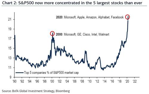
Leadership for the market is more concentrated than ever. Because of their cap weighting, they easily drive the NASDAQ, the S&P and even the Dow higher at the index level, but they also disguise building weakness as fewer and fewer stocks participate, including the NASDAQ 100 components.
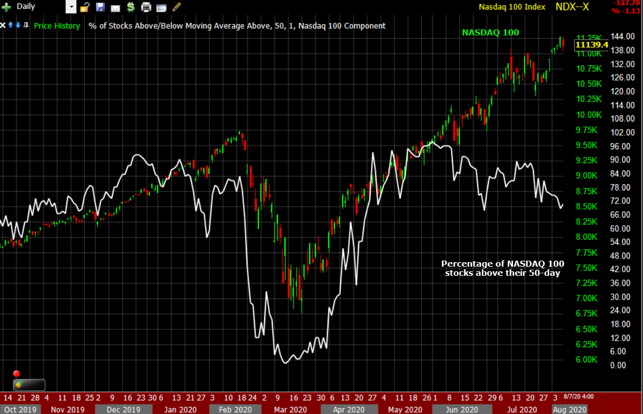
NASDAQ 100 (daily) and the percentage of NASDAQ 100 stocks trading above their 50-day moving average. As the NASDAQ makes higher highs, fewer NASDAQ stocks trade above their 50-day, or more and more fall below their 50-day. We saw the same narrowing leadership with the entire market dependent on 5 stocks in January and February of this year.
It’s not just the NASDAQ where breadth continues to deteriorate, but across the entire market.
NASDAQ 100 surpassed early 2020 highs in June, recently as much as +16% above. The S&P, in which the 5 mega-caps are more concentrated than ever, is a little more than 1% below the same level, yet the broadest index in the U.S. and the world, NYSE, is -10% below, and the median stock is -15% below.
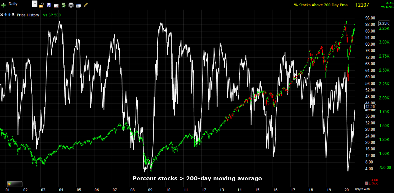
SP-500 (daily) and the percentage of NYSE stocks trading above their 200-day moving average. This indicator has steadily fallen since the S&P and Dow’s Broadening top began with the rally into, early 2018 and the sell-off that followed, but note how divergent the indicator is compared to the S&P’s early 2020 record high.
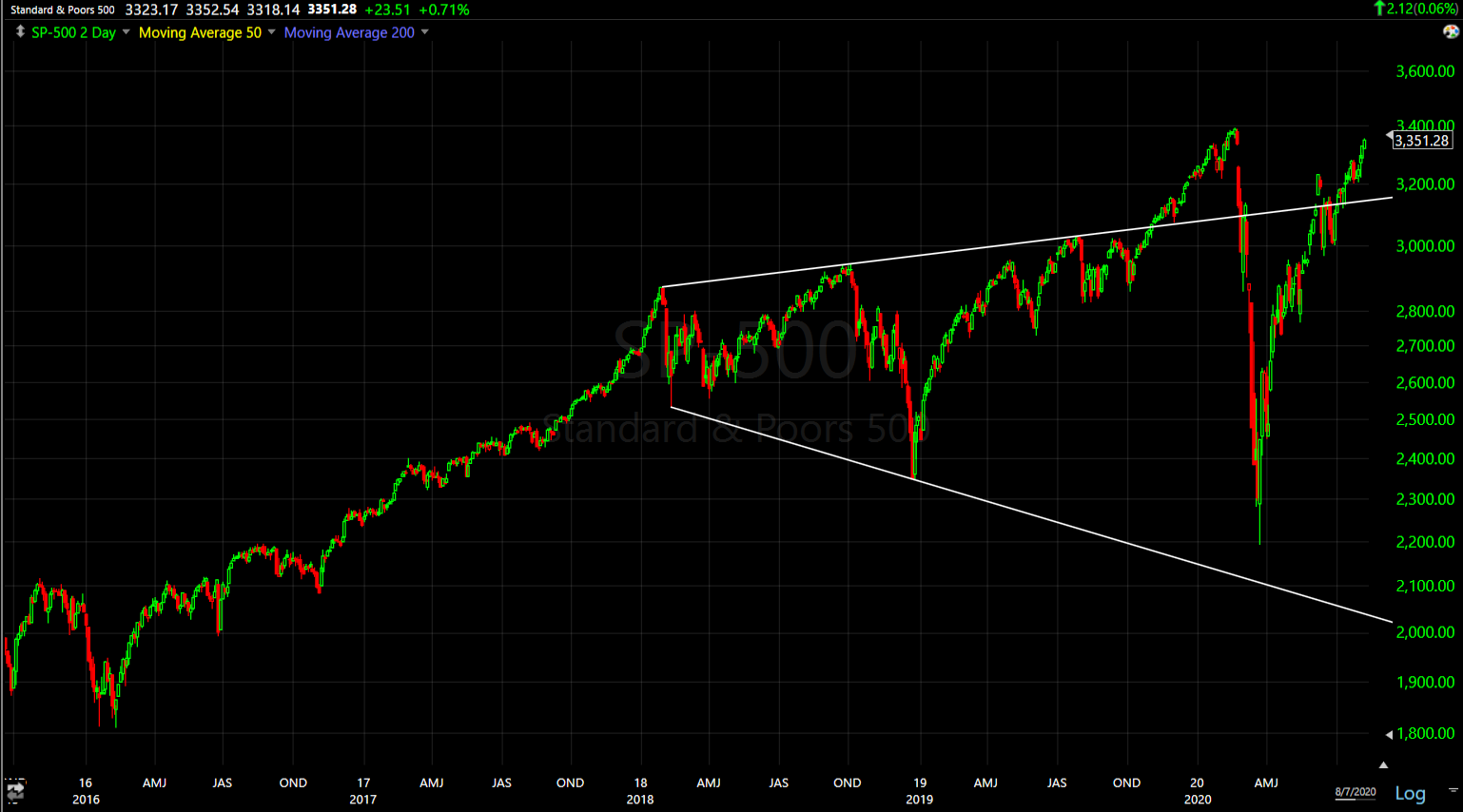 SP-500 (2-day) this was the initial broadening top. Prices rallied above as a result of the Fed’s repo operations and QE4 starting in September 2019.
The price action is still a chaotic broadening top, it’s just larger.
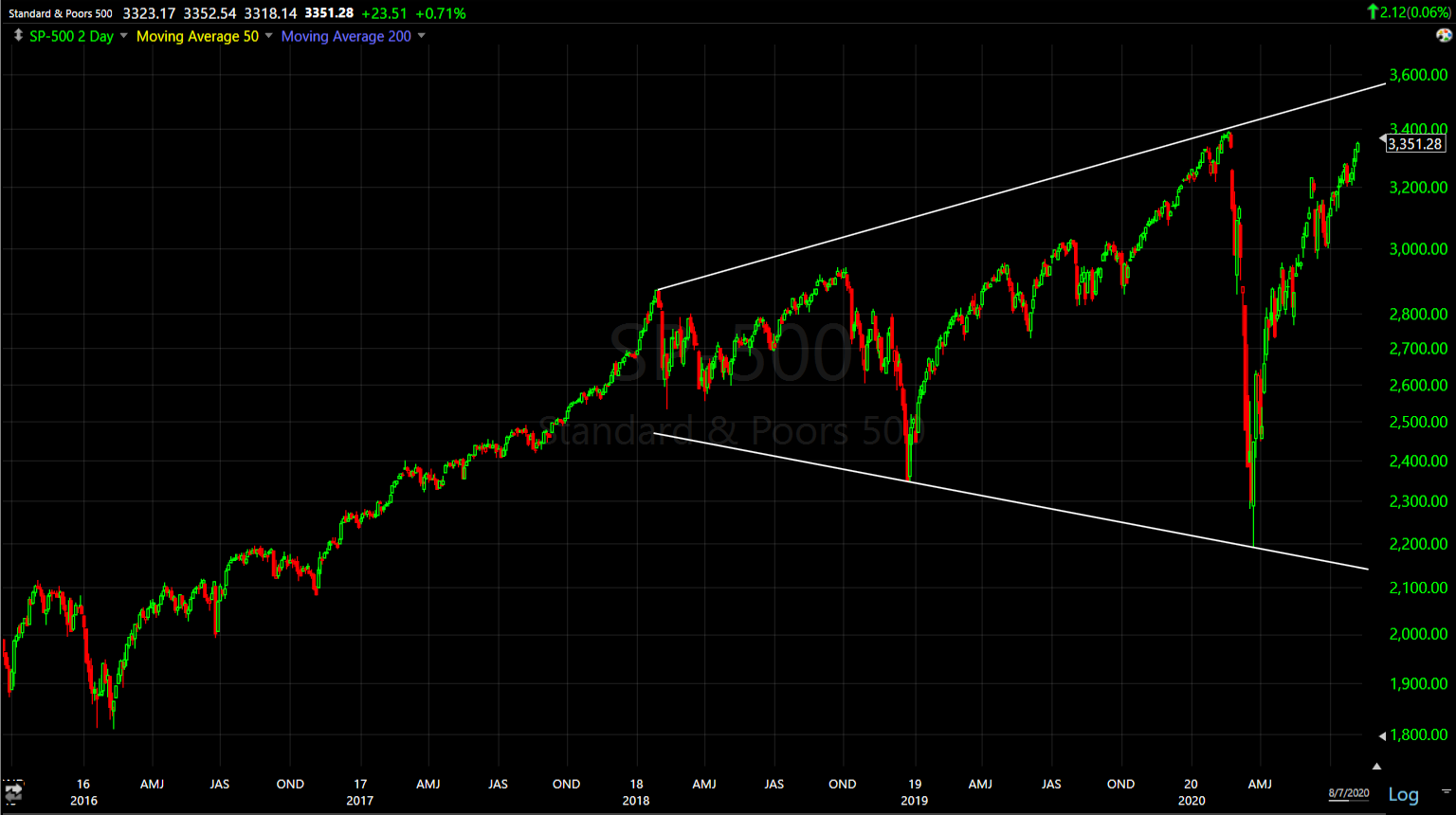 SP-500(2-day) revised BRT trendlines.
You don’t see many broadening tops, and fewer yet in a major index. I’ve never seen one this big anywhere, and least of all in a major index.
For more perspective…
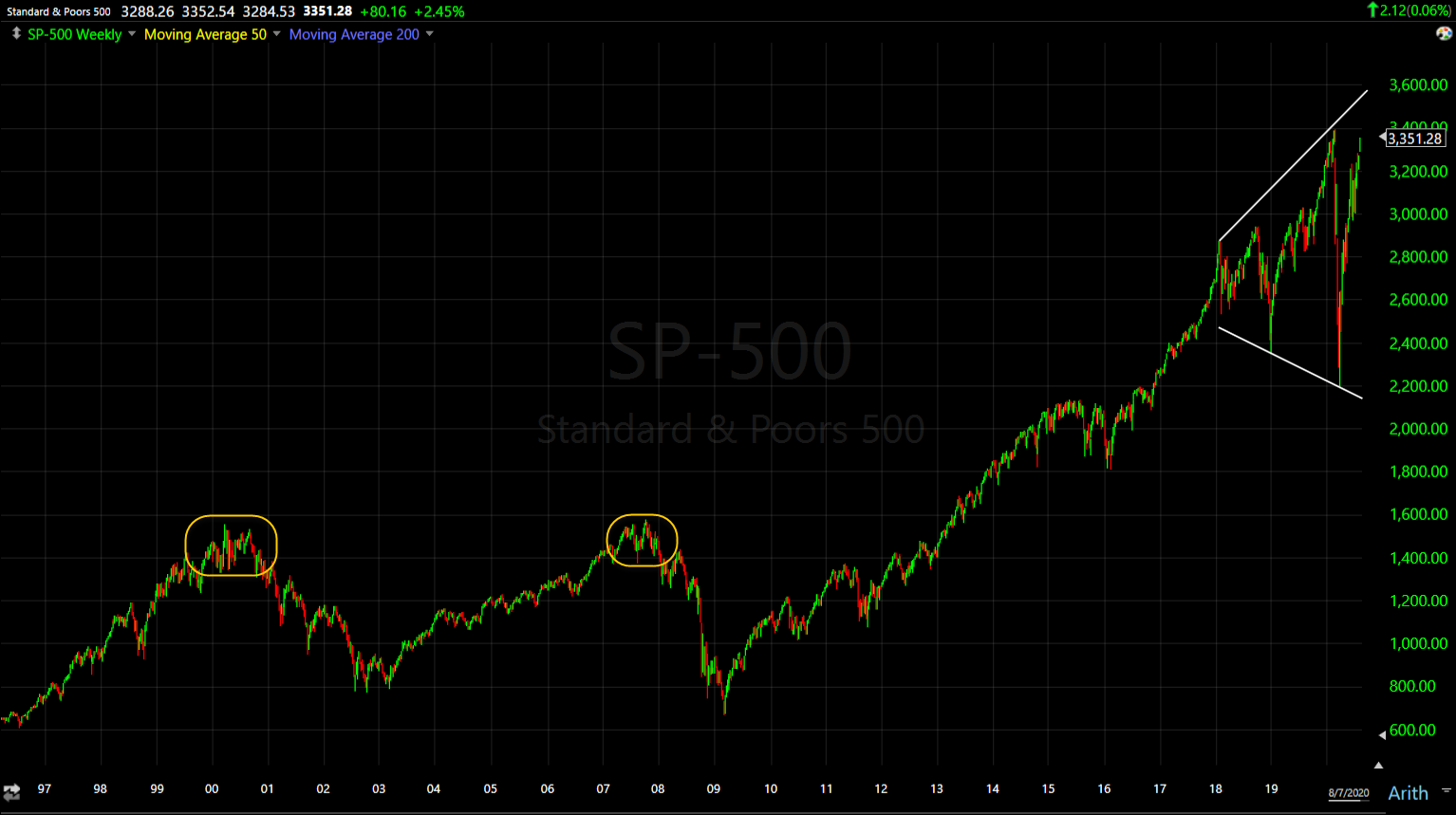
SP-500 (weekly) the two tops to the left in yellow are the Dot.com bubble and the 2007 top before the Great Financial Crisis. The price action since early 2018 is not bullish, it’s insanely chaotic. I suspect it’s the culmination of more than a decade of financial engineering by the Fed and other central banks. This isn’t your grandfather’s market anymore.
The Dollar
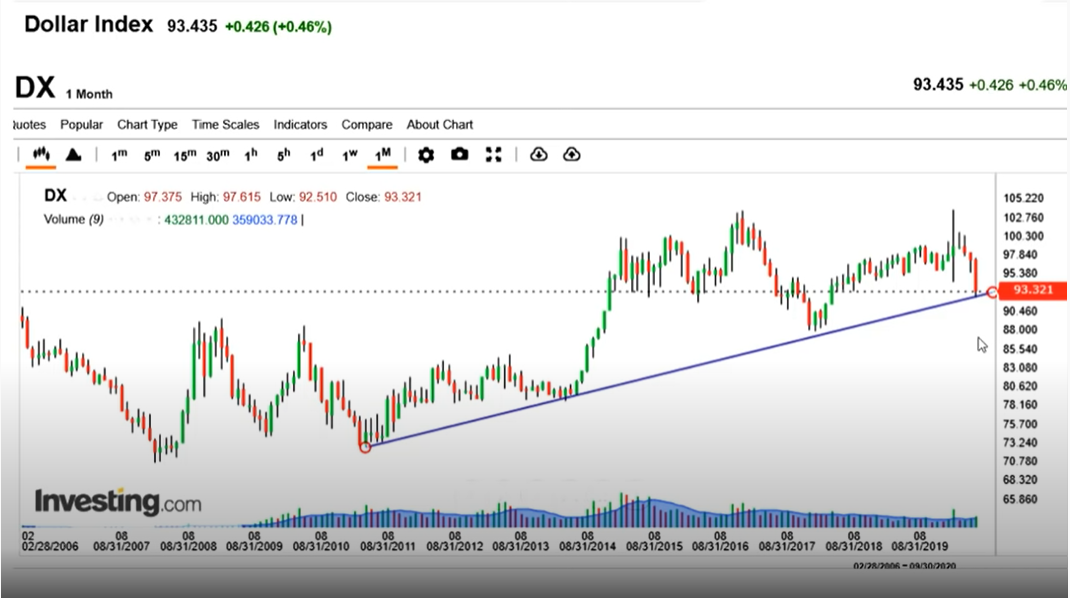
In last weekend’s video I talked about the Dollar’s potential to shakeup multiple asset classes from stocks to commodities and precious metals. Here’s the discussion in the video starting at 18:23. While the dollar has been killed the last few months, it did come down to a near decade long trend line.
U.S. Dollar
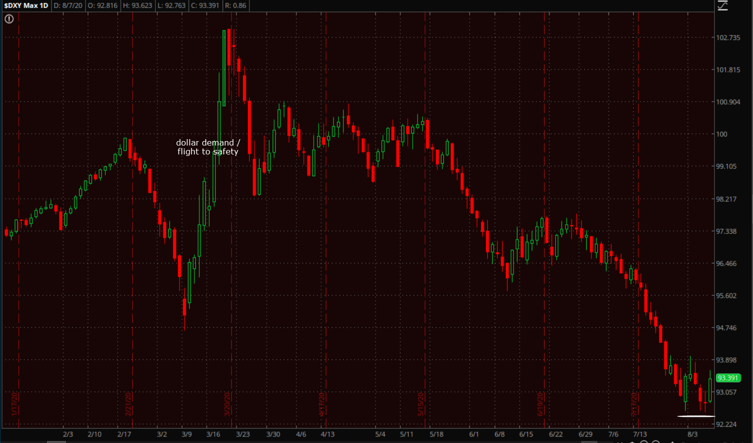
Early this week it looked like the dollar would add to the bounce off the trend line, then the dollar faded and looked as if it would break below the trend line. By the end of the week the dollar rallied. Ironically the catalyst was a stronger than expected Payrolls report.
 U.S. Dollar Index (daily) held the prior week’s low.
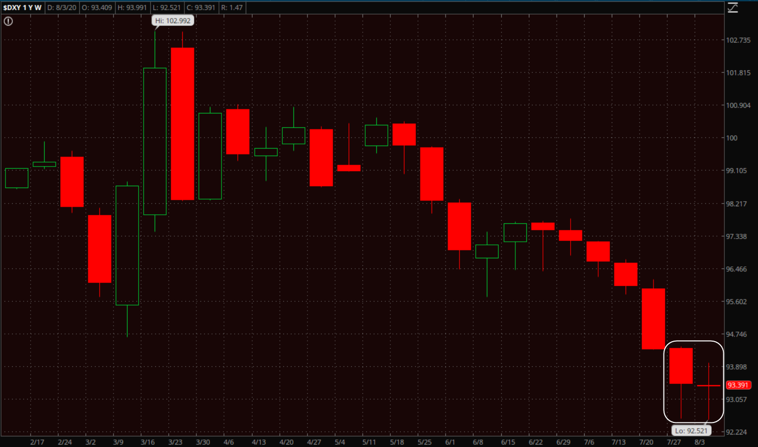 U.S. Dollar Index (weekly) Tweezer Bottom indicating a higher probability of support at the trend. And this as the Dollar is the most oversold in 40 years.
Here are some of the currencies that benefitted from dollar weakness and rallied against the dollar…
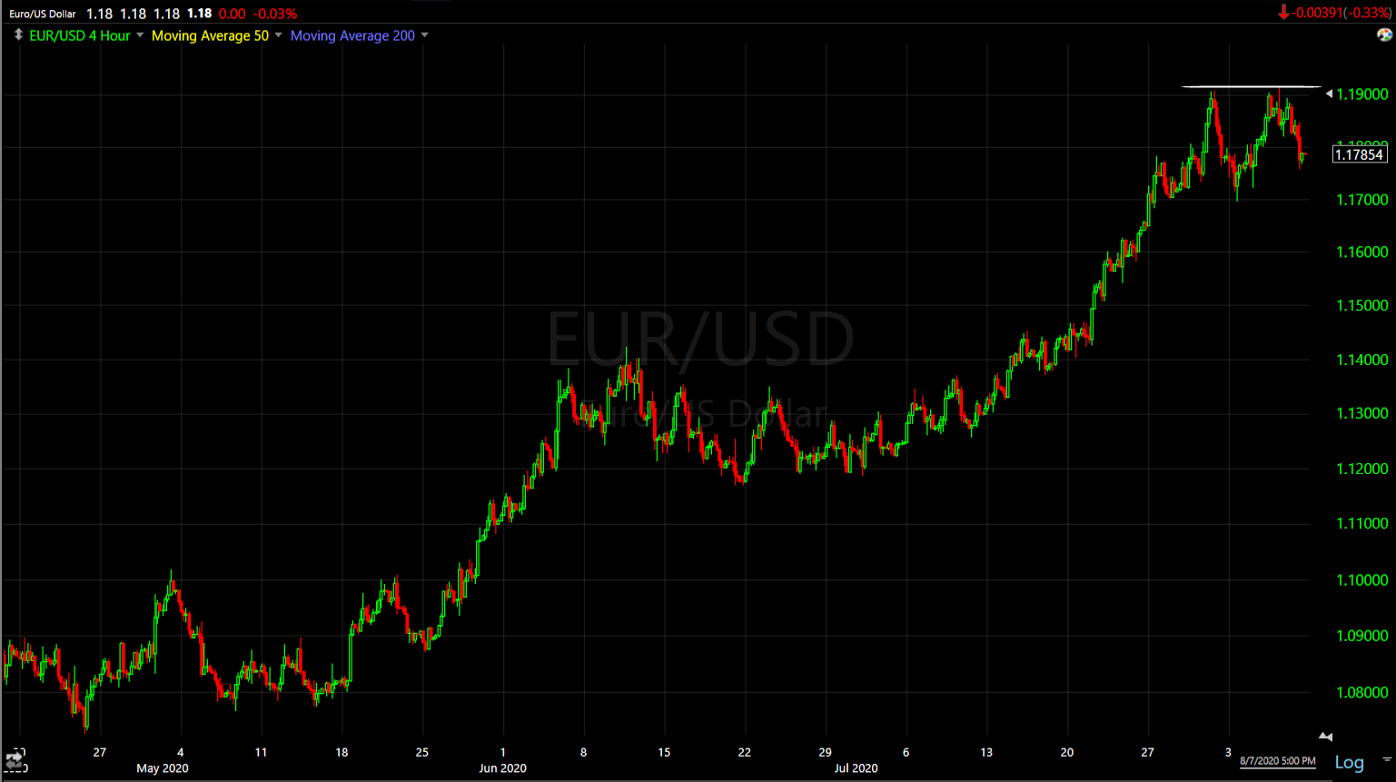 EUR/USD (4-hour) hitting resistance around 1.19
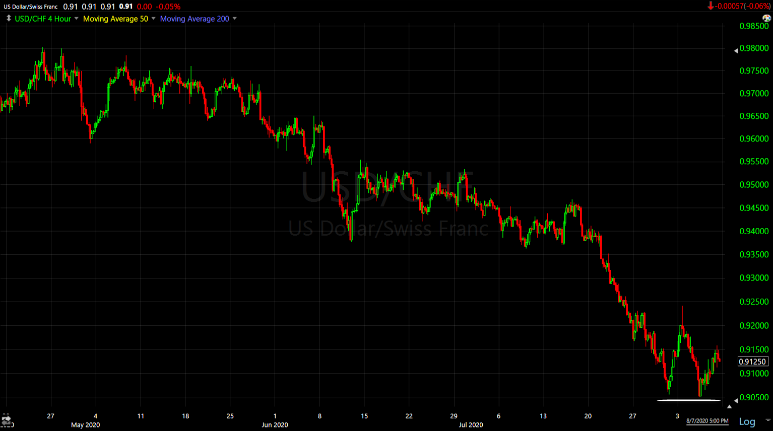 USD/CHF (4 hour) finding support around 0.9050
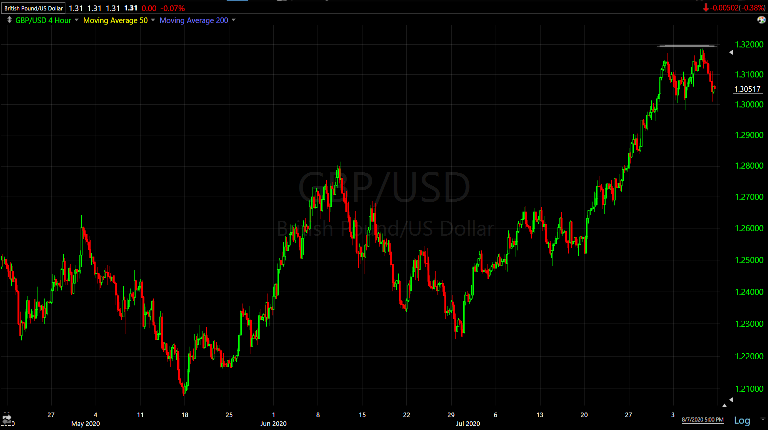 GBP/USD (4 hour) resistance near $1.32
Just over a week ago (Friday July 31st) USD/JPY made an odd move out of nowhere (higher). At the time I thought maybe it had something to do with a large positions being squared away on the final trading day of the month. I’m not so sure now as it took place the same day the Dollar tagged that decade long trend.
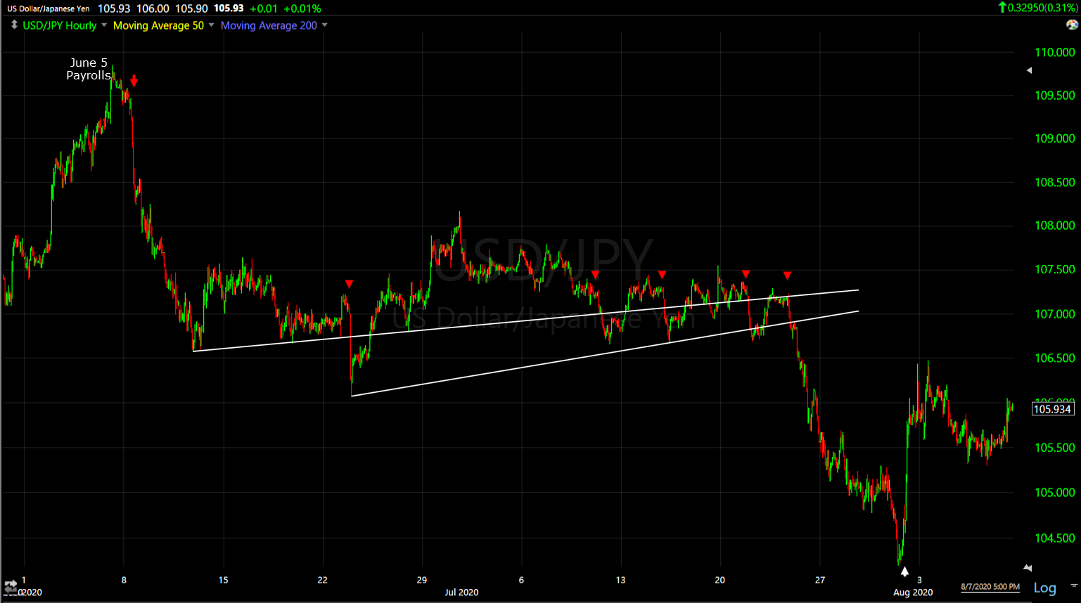
USD/JPY (60m) has been on my radar because each of these declines (red) have led some sort of risk-off event to one degree or another, so the spike higher (white) didn’t make a lot of sense with risks on the table like the deadlocked stimulus negotiations in Washington, or the rising tensions between the U.S. and China with Trump banning Tik-Tok.
Since the Yen was another one of the currencies to gain strongly against the dollar, I’m wondering if that wasn’t a position being closed (short Dollar/long Yen) in anticipation of a dollar rally off the decade long trend line?
A stronger dollar or even a dollar short squeeze, would likely have a huge impact on numerous asset classes including stocks. The U.S. Dollar and stocks have had a strong inverse relationship since March.
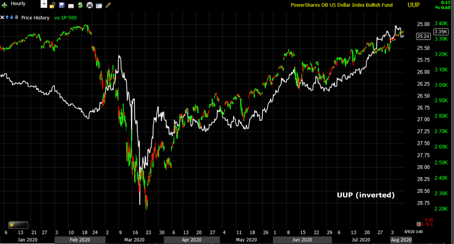
SP-500 (60m) and UUP (proxy for the dollar) inverted.
Emerging markets also have a strong inverse correlation to the Dollar and EEM has recently been on my radar (on the long side) because of constructive/bullish price action. The one concern I’ve been watching is the EM currencies as they have a tendency to lead the EM stocks both up and down. They are very sensitive to the U.S. Dollar.
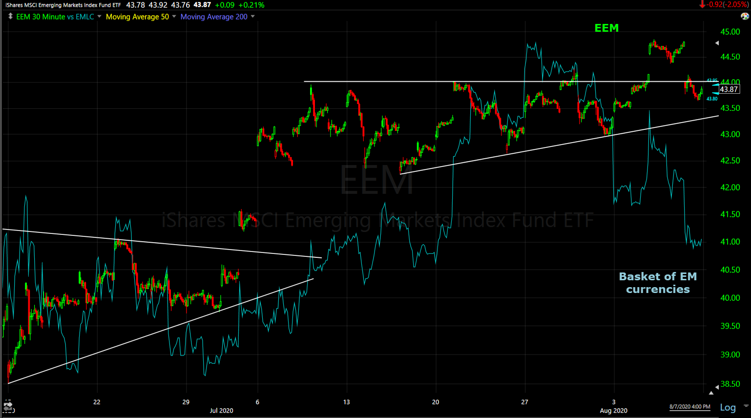 EEM (30m) trading in a bullish ascending triangle. Think of the ascending triangle as a coil storing up energy for an eventual breakout. I overlaid a proxy for a basket of EM currencies in blue. They had been constructive and leading EEM higher before EEM’s consolidation was mature, but they had recently turned down. It wasn’t a major concern, but they made a lower low last week which is an increasing concern, especially with the Dollar sitting at a key trend line.
And while not specifically caused by the Dollar, we saw an emerging market currency crash to record lows last week – the Turkish Lira.
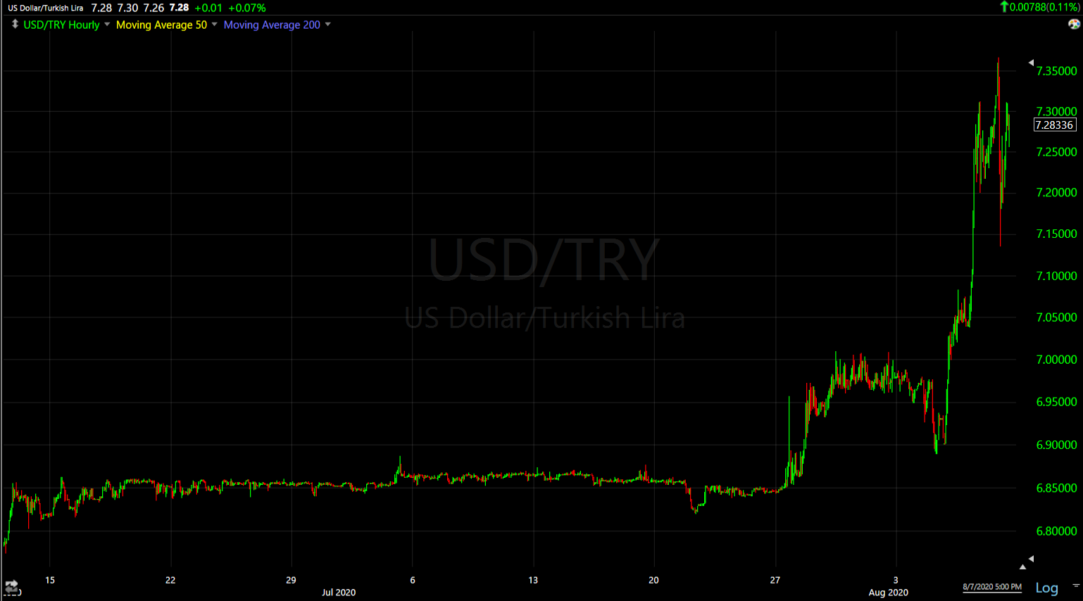
USD/TRY (60m) Lira crashing against the dollar. A stronger dollar from here would only exacerbate the negative effect for the Lira, and other EM currencies which tend to lead the EM stocks.
Other assets that have a strong correlation or inverse correlation are commodities and precious metals. I’m not going to spend too much time on gold. You probably know my view- it’s insanely strong and has a bullish trend, but it’s too far extended on the upside from support for me to chase prices to enter new long trades. I bought some GDX/gold miners because they spent some time consolidating constructively, but if the Dollar gains it will pressure gold, silver and ultimately the miners.
Two other Dollar sensitive commodities that have been on my radar are crude and copper.
I’ve been watching WTI crude for a while as it trades up toward $42 because there’s a massive zone of overhead supply starting at $42.
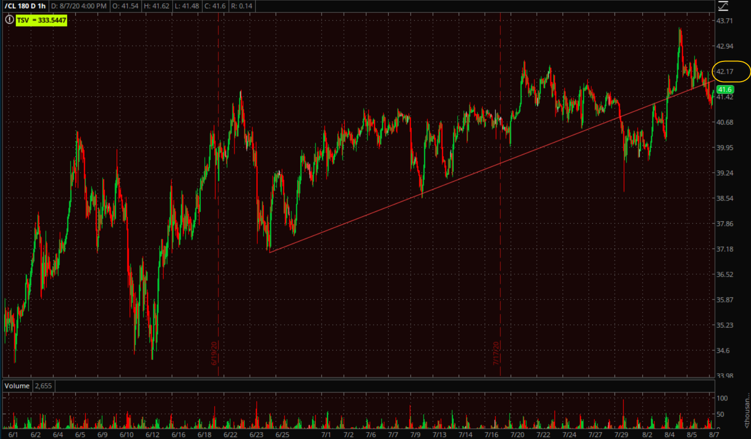 WTI crude futures (60m) just over a week ago they broke below this trend line, but jumped above this week. Notice they haven’t made much progress above $42.
Here’s the bigger picture…
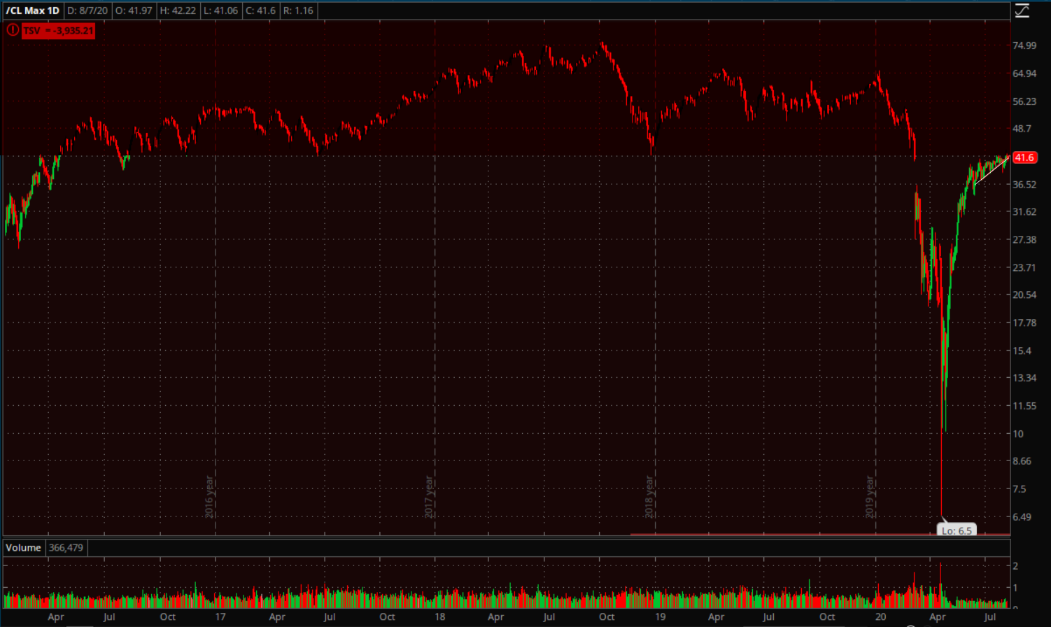 WTI Crude (daily) after the crash and trading negative, crude has rallied back strongly, but has lost momentum near $42. I highlighted price above $42 in red, that’s the massive overhead supply or resistance. You might be able to make out the minor trend line from the chart above in white. I think WTI crude is at a key area and a stronger dollar or a short squeeze, could be the deciding factor.
Crude is one of the macro overlays I track as it relates to the stock market.
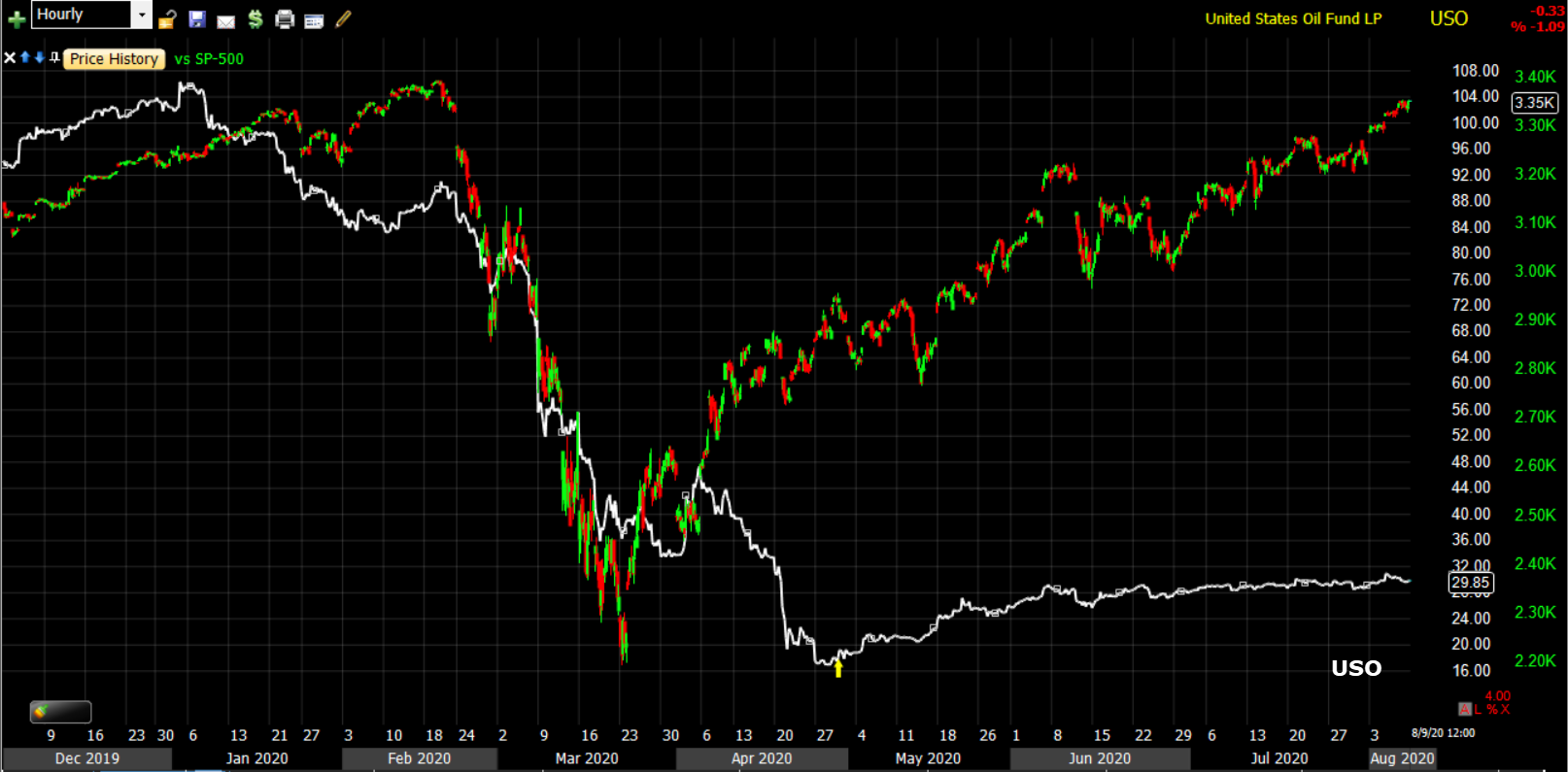
SP-500 (60m) and USO. Recall that Crude was one of the asset classes sending a macro risk off signal in early 2020, leading the S&P lower. Copper and bond yields did too.
Copper would likely be effected too by a higher dollar.
In last weekend’s video I discussed the Copper:Gold ratio. Here’s the clip starting at 16:48. The takeaway was that the ratio between the two, and the plunge in yields, suggested that gold should outperform and copper should underperform. We’ve recently seen gold outperforming…
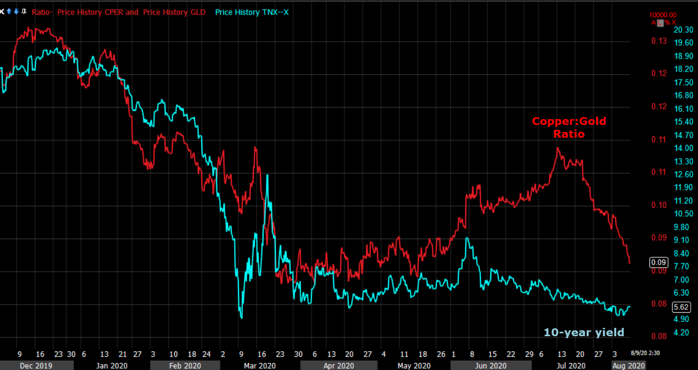 Copper:Gold Ratio (red) and the 10-year yield (blue). Yields have been leading the ratio lower suggesting that the industrial metal, copper, should trade lower on lower growth expectations, and gold, a safe-haven asset, should outperform. The red line sinking recently is gold outperforming copper as yields suggested. That continued this week.
In fact, copper futures broke a recent trend with the sell-off accelerating at the end of the week.
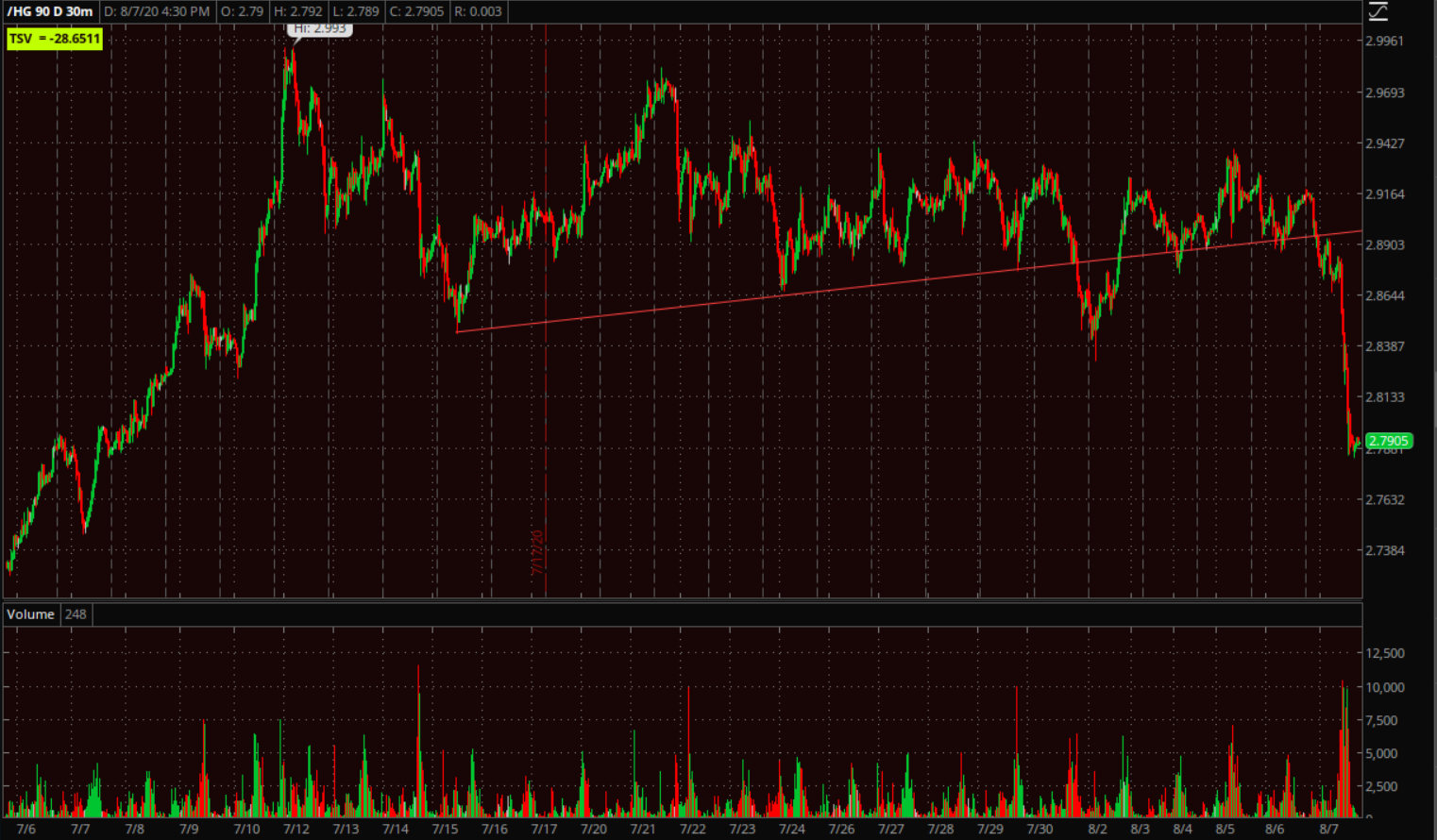 Copper futures (30m)
In fact Copper and Crude futures look very similar with both at key short term trends.
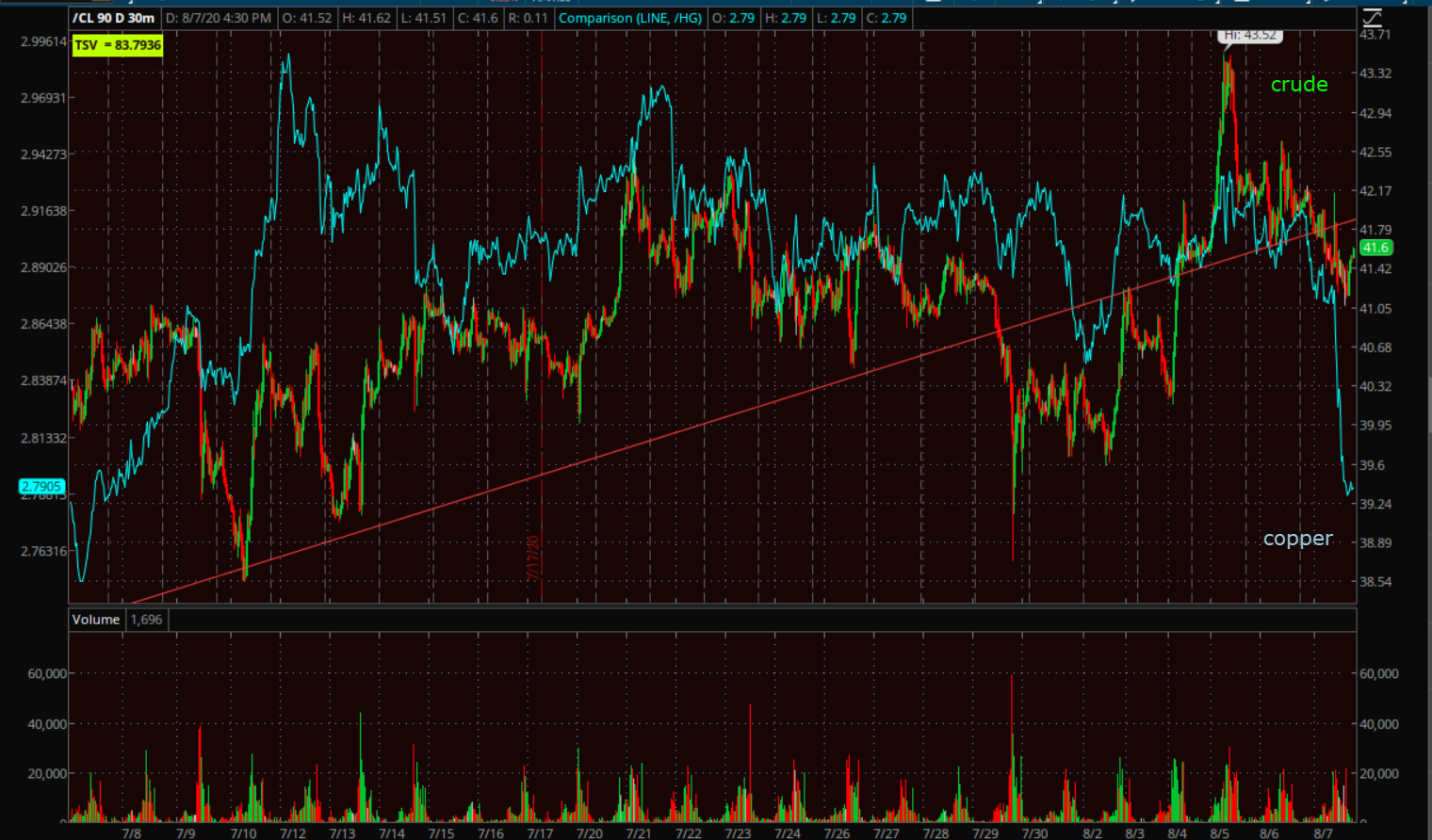
WTI Crude futures (30m) and Copper futures (blue). Both have recently probed below the minor uptrend. Crude ended the week right at the trend, copper below the trend.
As a macro overlay, Copper has given some key leading signals for stocks recently.
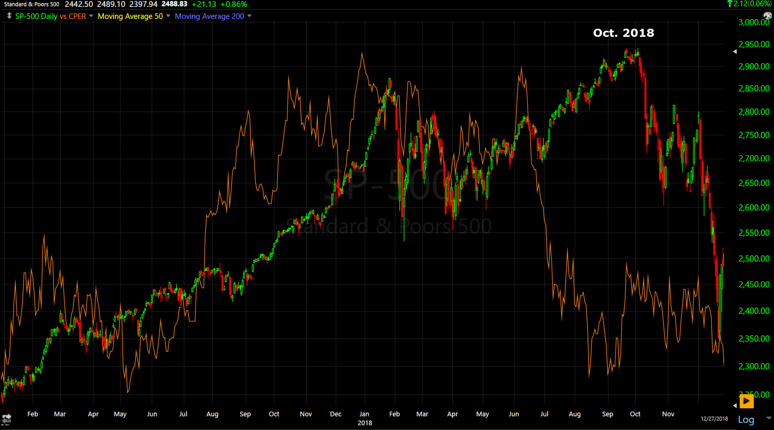 SP-500 (daily- rolled back to 2018) – Copper took a sharp turn lower and ultimately led stocks lower when the S&P crashed 20% from October to December 2018.
Copper (as well as crude and yields) did it gain earlier this year…
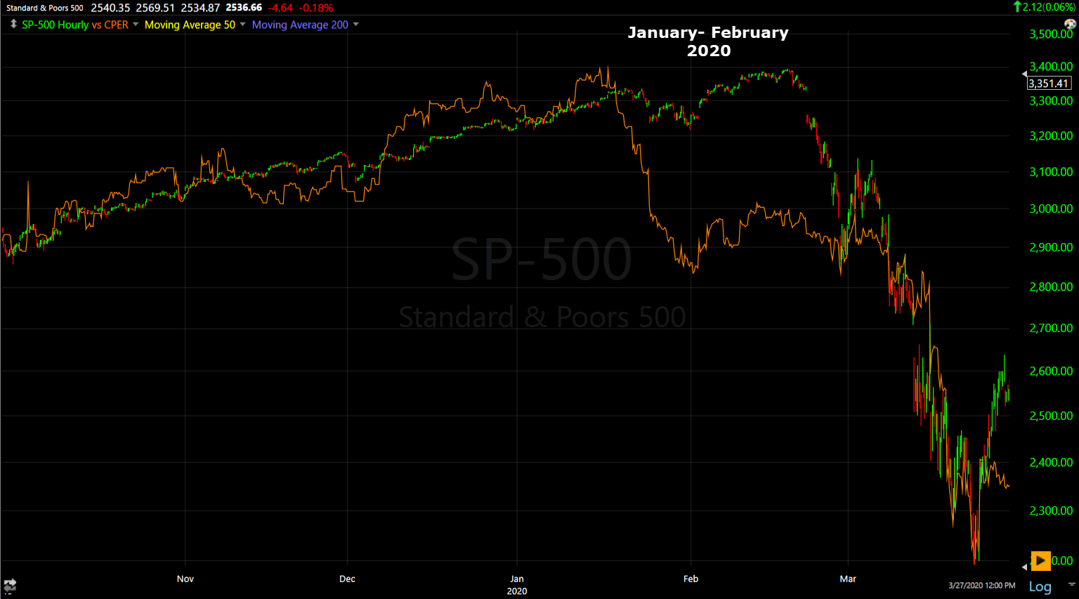 SP-500 (daily) and Copper leading lower.
Here’s how the S&P and Copper ended the week.
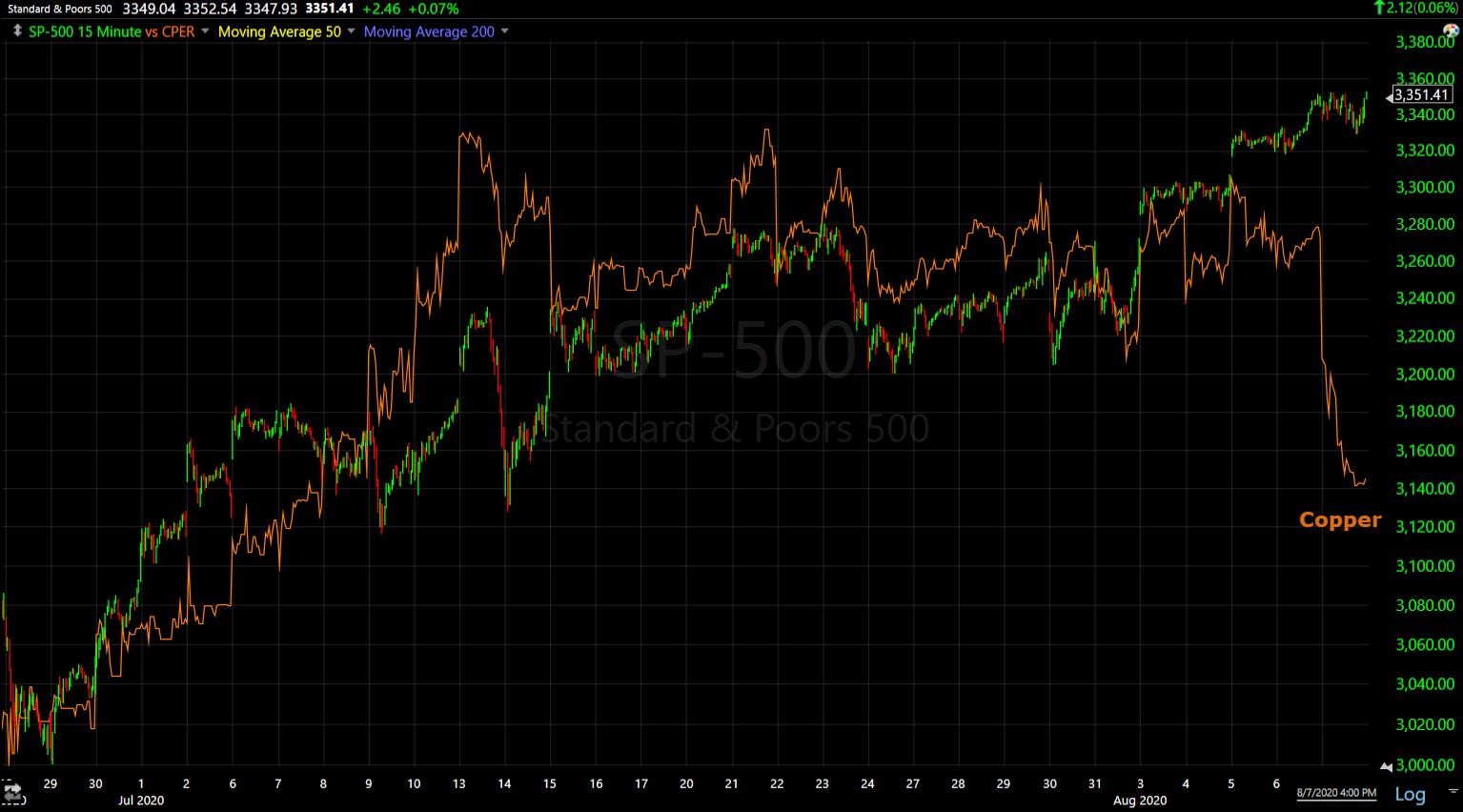
SP-500 (15m)
Due to the Fed and other central banks constant and increasing intervention in markets, I believe stocks have effectively lost their discounting function. Commodities, currencies and the bond market have had a much better track record at forecasting macroeconomic events than stocks. As you can see with the examples above, stocks are the last to get the macro message.
The Copper:Gold ratio and 10-year yield chart above is yields saying that gold (safe haven and correlated to real yields) should be stronger and copper (industrial metal) should be weaker relative to gold. Since copper is a industrial metal and gold is a safe-haven asset, that’s a negative macro sigal on its own, but bond yields themselves have also been clear in not buying the v-shape economic recovery that stocks have fully discounted with historically expensive multiples that are based not on this quarter or year’s earnings, but on expected earnings 1 to 2 years out!
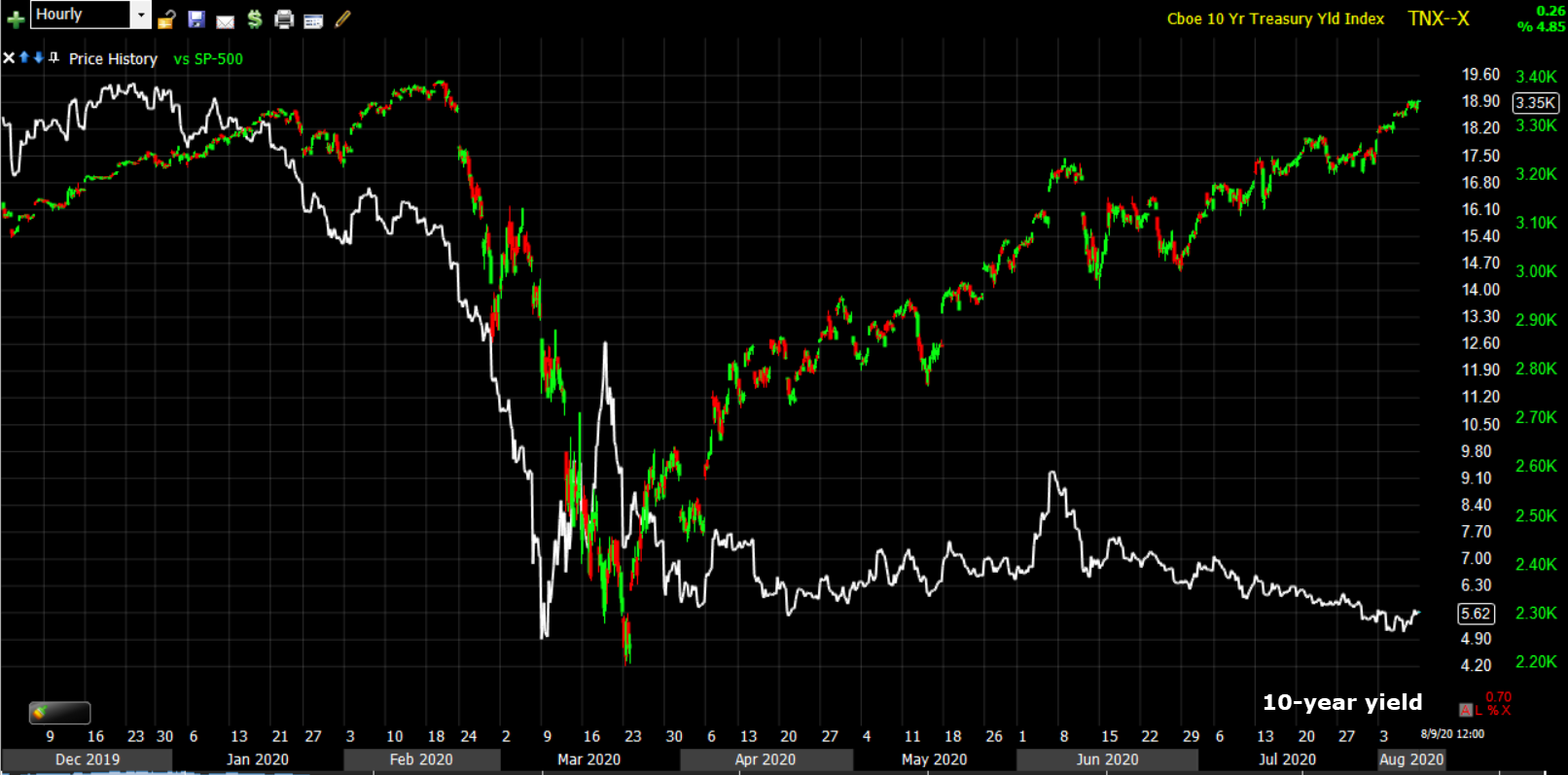
SP-500 (60m) and 10-year yield. The bond market was paying attention to what was happening in Wuhan China early in the year while stocks ignored it completely… until they couldn’t. Yields led the S&P lower (as did copper and crude).
Since the market low and S&P rally, yields barely moved higher early on in the market rally, but have been steadily tracking lower since early June with multiple tenors making all time record lows even as the NASDAQ makes all time record highs.
Here’s a closer look…
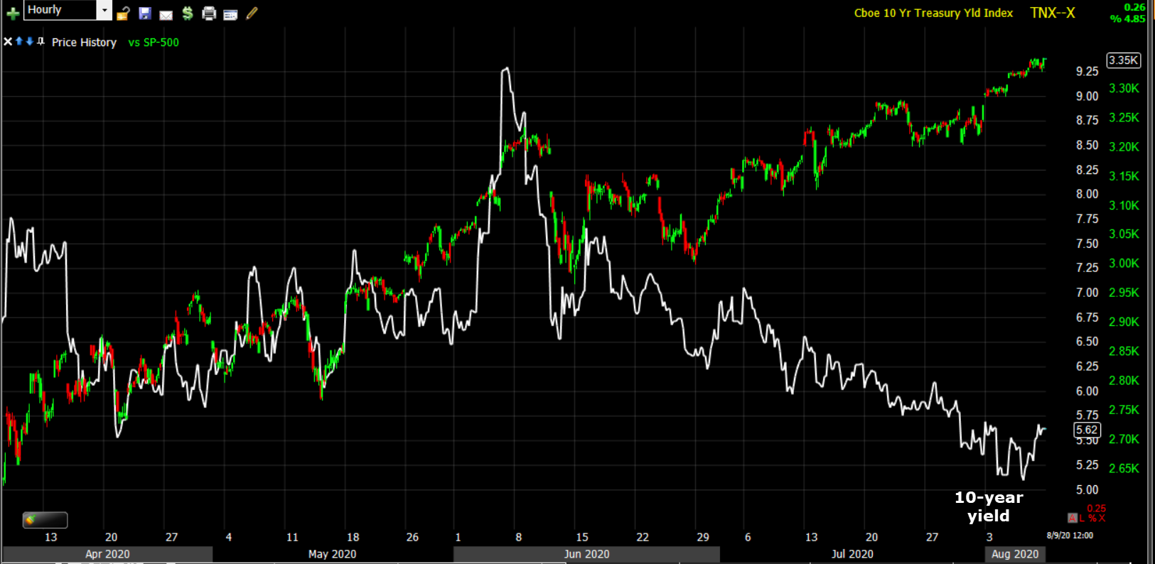
SP-500 (60m) and 10-year yield sharply diverging since early June.
Yield curves have sharply flattened since then too.
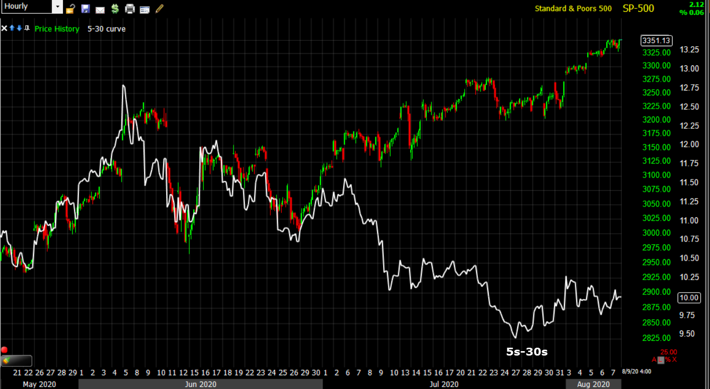
SP-500 (60m) and the 5s-30s curve flattening since the May Payrolls reported on June 5th, and since the rise in U.S. COVID cases.
When an economy is starting recovery supported by extraordinary Fed accommodation, curves steepen sharply, in fact they look like a rocket launch. They don’t flatten like this. And as I have shown numerous times, yields almost always sniff out an economic recovery first and lead stocks higher. Yields are making all time record lows as NASDAq makes record highs.
The chart below shows how interest rates depict where you are in the economic cycle and that has a high correlation with the stock market.
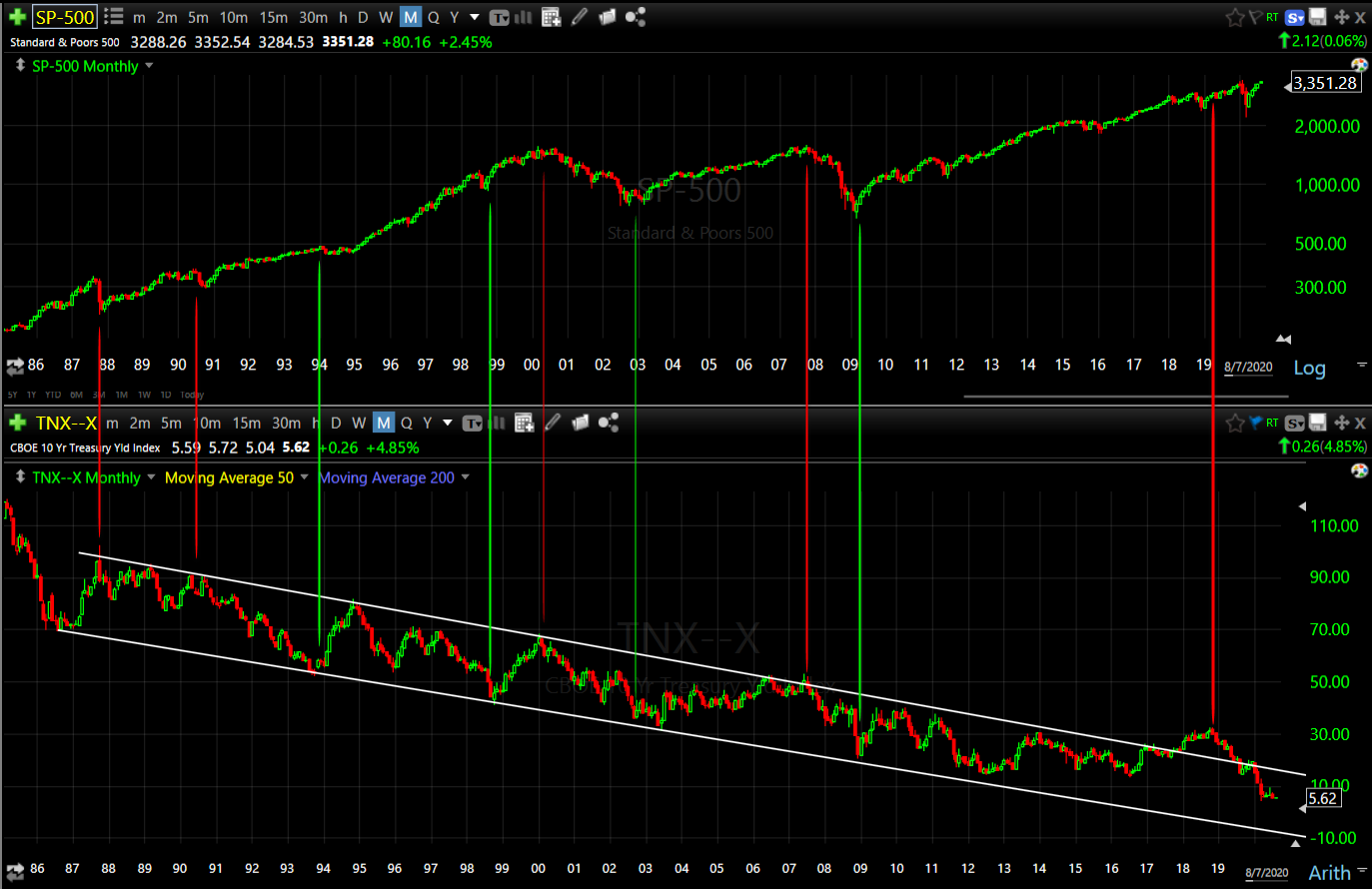
SP-500 (monthly) and 10-yea yield. The 10-year yield’s channel is a very clear depiction of Fed interest rate policy over the last 4 decades. It also tends to define the top and bottom of economic cycles. When the 10-year hits the top of the channel debt becomes burdensome and the economy typically moves to a recession, or in some cases the market sells off without a recession like the 1987 crash to the far left. The top of the channel coincided with the Dot.com bubble top, the Great Financial Crisis and hit the top again in 2018 which was followed by the October-December 20% decline in the S&P.
Conversely, the 10-year hitting the bottom of the channel has depicted the start of a new economic cycle and bull market like 2003 and 2009 (green).
The historical trend suggests not only have yields not bottomed (nor has the economic cycle), but there’s a high probability they go negative. Real yields are already negative, printing -1.1% this past week.
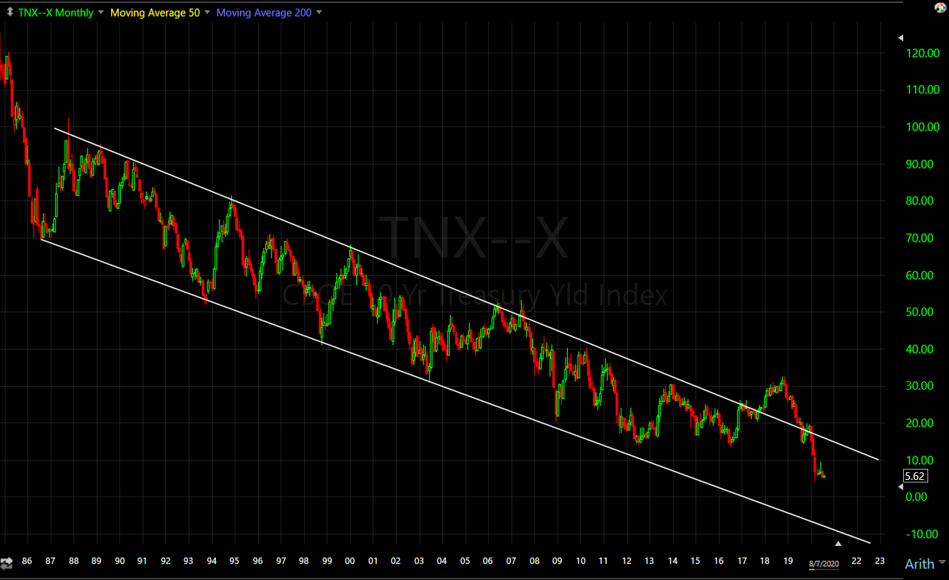
10-year yield (monthly) the trend suggests the 10-year yield goes negative. More to my point, yields typically depict the end of a recession when they hit the bottom channel, and they tend to lead stocks higher (bonds get the message first). Is the chart above infallible? No. However, most of your edge in markets is based on probabilities.
Wrap
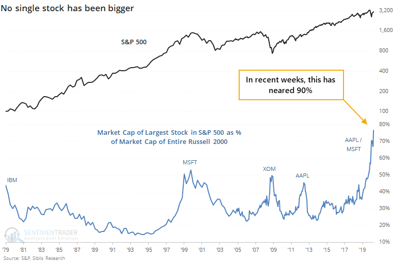
The market is more reliant on 5 stocks now more than ever. The weight of those 5 stocks has masked broad weakness in the market of stocks.
Sentiment Trader noted this on Friday:
“The biggest stock in the U.S. and nearly the world, Apple, keeps powering higher. At the end of June, the value of Apple alone was nearly 80% of the Russell 2000 index’s market capitalization. As of today, it’s nearly 90%. This is astounding – in the past 40 years, no single stock has come close to dwarfing the value of so many other companies.“
With market breadth so fragile and dependent on so few stocks, and with the bond market signal disagreeing and negatively diverging with stocks’ optimism, there’s not a lot of room for error or surprises. A dollar rally, or even a decent short squeeze, could have dramatic effects across multiple asset classes, some of which could multiply the effect for stocks.
I can’t recall a time recently in which the Dollar’s trajectory could so significantly shift the balance of probabilities across multiple asset classes, and at a pretty chaotic time. At the same time, so few participants seems to even be considering the possibility. I have to wonder whether recent moves in assets like copper, the Yen, maybe even cryptos, have been foreshadowing the possibility?
This is not to say that the Dollar is the only factor at play. I just think the market has seen so much dollar weakness that it takes it for granted and may be surprised in a big way by dollar strength or even a short squeeze. The consequences could catch a lot of people wrong-footed and have surprising domino effects.