Weekend Stock Market Update- From Worst to First
Happy Passover and Happy Easter.
The theme of the week was from worst to first. The market rallied strongly on a turn in infection rates of corona virus in New York last weekend. The same stock market that didn’t see any risk coming at all time highs in February, is pricing in the end of the epidemic and a v-shaped economic recovery.This screen capture pretty much sums up the dichotomy that was the market last week.
Initial Claims this past week were higher than either of the two prior weeks and most likely have no peaked.
This weekend Disney World furloughed 43,000 workers.

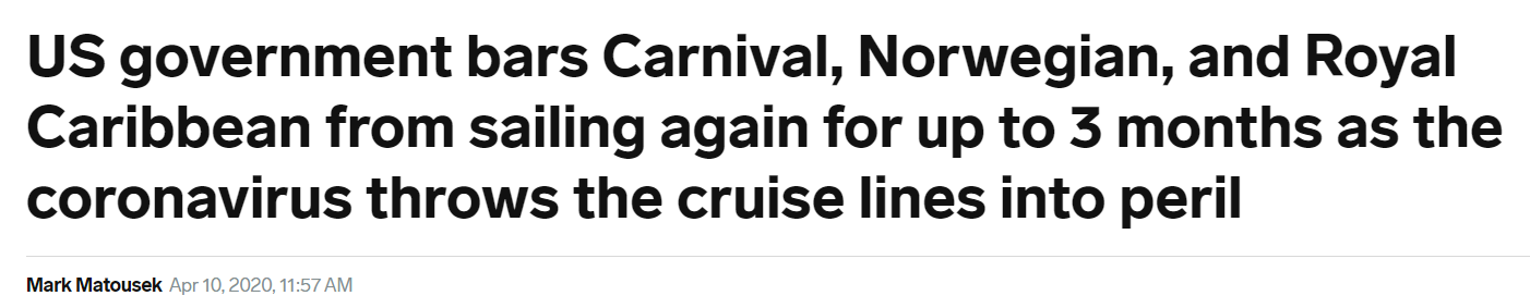
Each morning I was looking at the stocks that were the best performers in pre-market and they were typically cruise lines, airlines, banks, Retail and energy. You could say the trend was “from worst to first”, or what some others have called the “re-opening the economy” trade. A reasonable case could be made that someone knew the Fed was stepping up with yet another ($2.3 trillion dollar) rescue program before it was public. The “worst to first” stocks were the ones that stand to gain the most. Just take a look at some of the headlines from last week….


Yet these were the stocks that outperformed on the week.
Royal Caribbean Cruises (RCL) gained +65%
Ford (F) gained +26%
American Airlines (AAL ) gained+39%
Kohl’s (KSS) gained +73%
The Gap (GPS) gained +60%
They stood to gain because in addition to the Fed buying bonds and investment grade corporate bonds, the Fed announced Thursday (and this seems to violate the Federal Reserve Act) that they’d also buy high yield, or junk credit. The result….
Meanwhile, Investment grade credit is back near all time highs. There’s apparently no need for credit rating agencies if Fed buys everything.
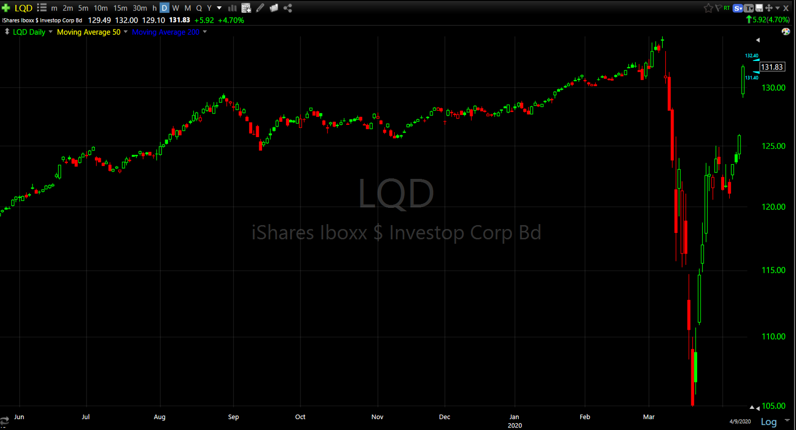 Investment Grade Credit (daily)
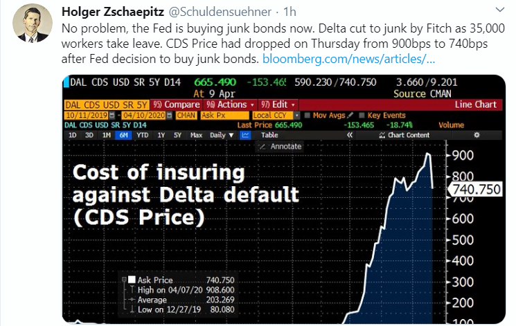
And high yield, or junk credit, of which many “fallen angels” like Delta airlines had recently been cut to, had the biggest gain in 2 decades as the Fed also stated it would buy junk credit ETFs like HYG.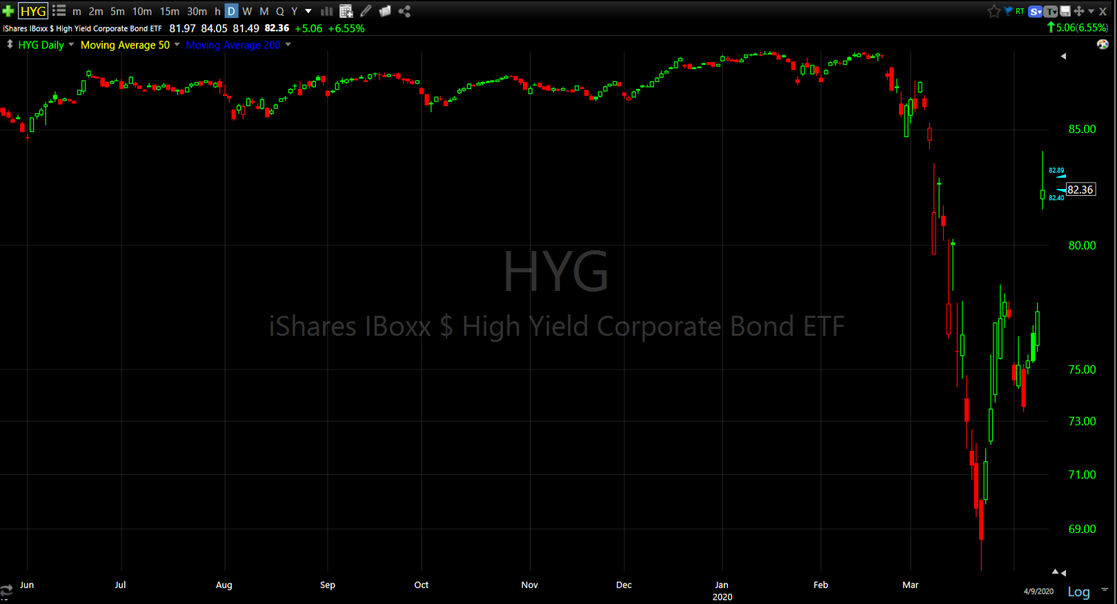
HYG (daily)
For those of you who track HY credit’s relative performance to the S&P as a leading indicator, be careful as the Fed is out there buying it and distorting prices and risks. I don’t know for sure, but I suspect it’s not going to be nearly as useful as it once was.
In mid-March companies with strong balance sheets outperformed those with weak balance sheets for obvious reasons. That dynamic entirely reversed last week…
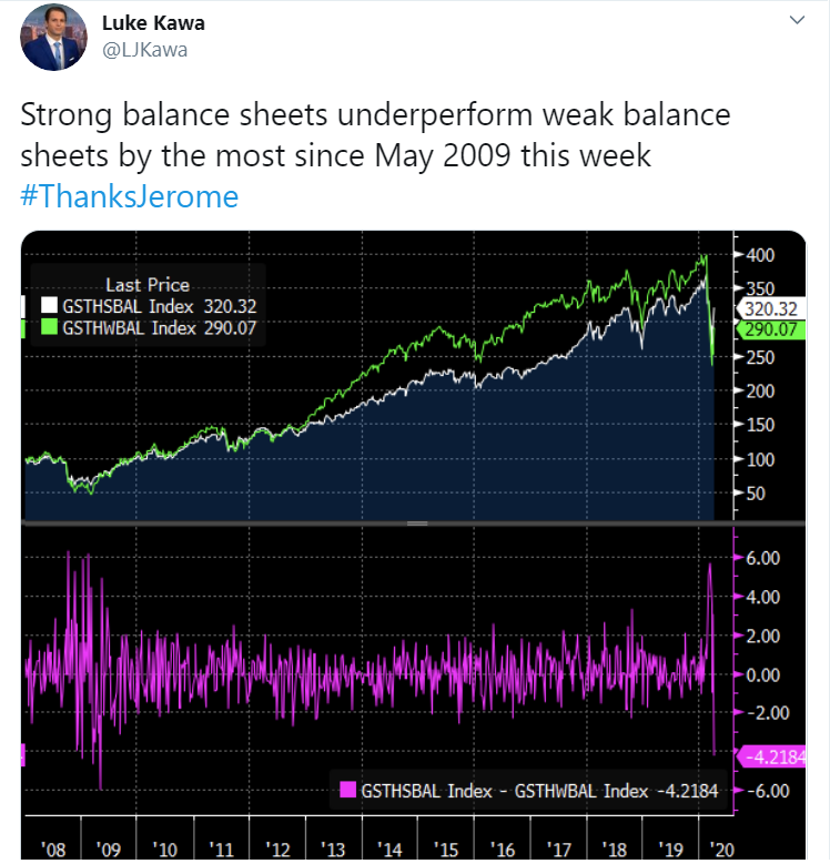 From worst to first…
This is why I think the Fed’s newest plan released on Thursday, was probably known by insiders well before then as the worst companies with the weakest balance sheets, that stand to benefit the most from the Fed buying their junk credit, clearly outperformed. The last week or two of the crash was largely credit and solvency related fears so the Fed probably took that off the table for now, thus investors willing to bid up these companies last week. However, once again the Fed has done a marvelous job at distorting actual risks by trying to take them off the table with a tidal wave of liquidity. Liquidity and solvency are two sides of the same coin, but it does not address growth and earnings.
 Remember that even before Corona virus, he U.S. manufacturing sector was already in recession. The U.S. is primarily a services economy and services usually account for 2/3rds of GDP. In 2019 US consumption spending made up 90% of the economy as the S&P rallied on zero earnings growth. Now consumers are on their back wondering how they’ll pay their bills.

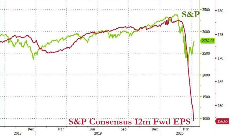
Last week Credit Suisse chief equity strategist Jonathan Golub – suggested that any “temporary” cheapness in stocks hit in late March was long gone for the simple reason that forward earnings have plunged. As a result, as of Tuesday forward stock multiples had surged back 19.0x, which Golub writes, “is the same level the S&P500 held on Feb 19, the all-time high.” That would suggest that as of Thursday’s close they’re even more expensive, or the most expensive ever.

In any case, what I noticed last week was that the stocks that have been the favorites and have massively outperformed through out the crash and really up until last week, were showing relative weakness. Technology and Communications were near the bottom of last week’s S&P sector leader-board, which was manifested in NASDAQ 100 being the laggard on the week.
 NASDAQ 100 (30m) and relative strength vs. the benchmark S&P has been notably strong as investors are loathe to sell the favored story stocks of the last decade, the mega-cap FAANG type names that were nearly single-handedly responsible for the Q4 2019 – Q1 2020 rally (about 6 stocks). Notice they under performed last week, especially after the mid-week triangle consolidations.
We saw this with the Technology sector and semiconductors that have also been immensely popular with the bulls.
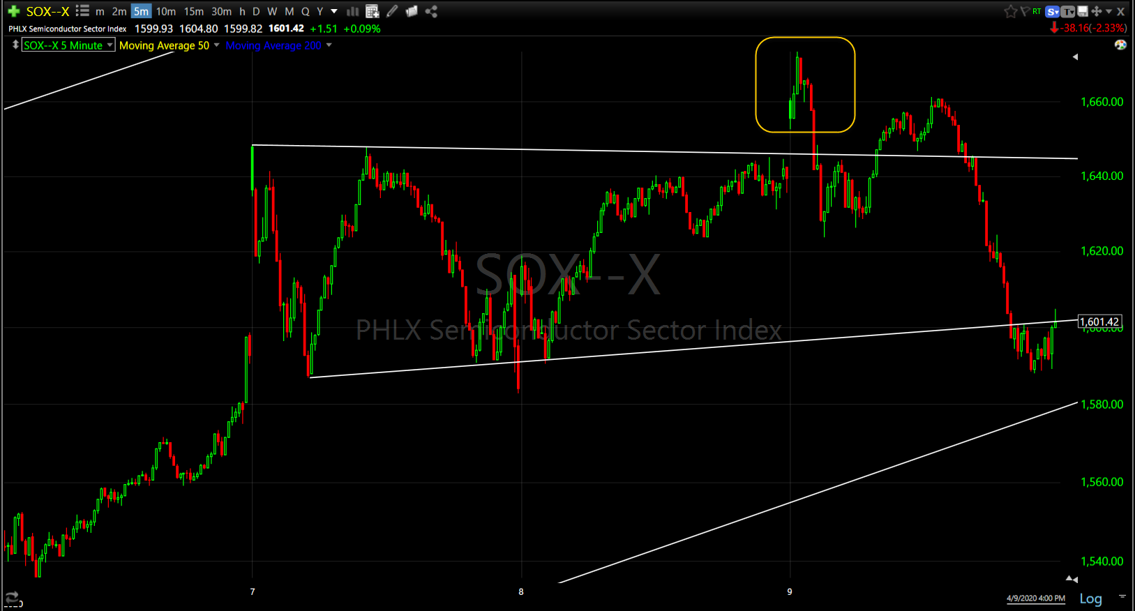 Philly Semiconductor Index (5m) with a failed attempt to breakout Thursday.
On the other hand, Small Caps also went from worst to first, nearly doubling the NASDAQ 100’s performance on the week. IWM (30m) and relative strength vs. the benchmark S&P. Small Caps entered the week leading the broader market lower before the largest weekly short squeeze in history. The S&P as up +12.1% on the week, the most shorted stocks were double that, up +24.9%!
I always respect small caps’ relative performance as it tends to lead the broader market, but it’s good to know where it is coming from as well.
At the end of the week price action was still constructive, especially in the worst-to-first sectors like Materials, Financials/Banks, the Retail sector, Utilities and Real Estate.
 Materials sector (15m)
Energy had been among the week’s leaders, but lost some shine toward the end of the week.
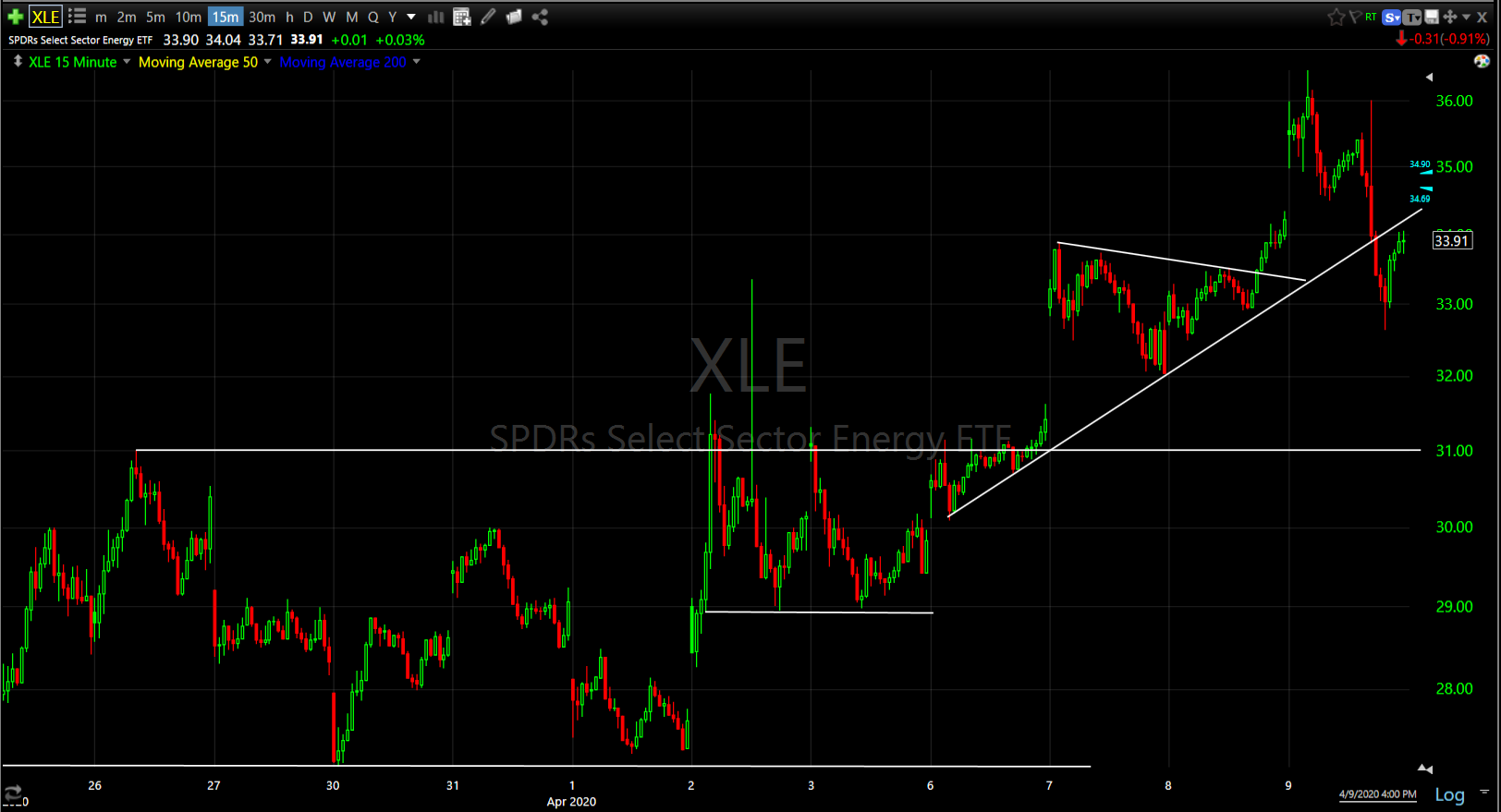 Energy sector (15m)
Technology also struggled relatively speaking, but the short-term price trend is still constructive.
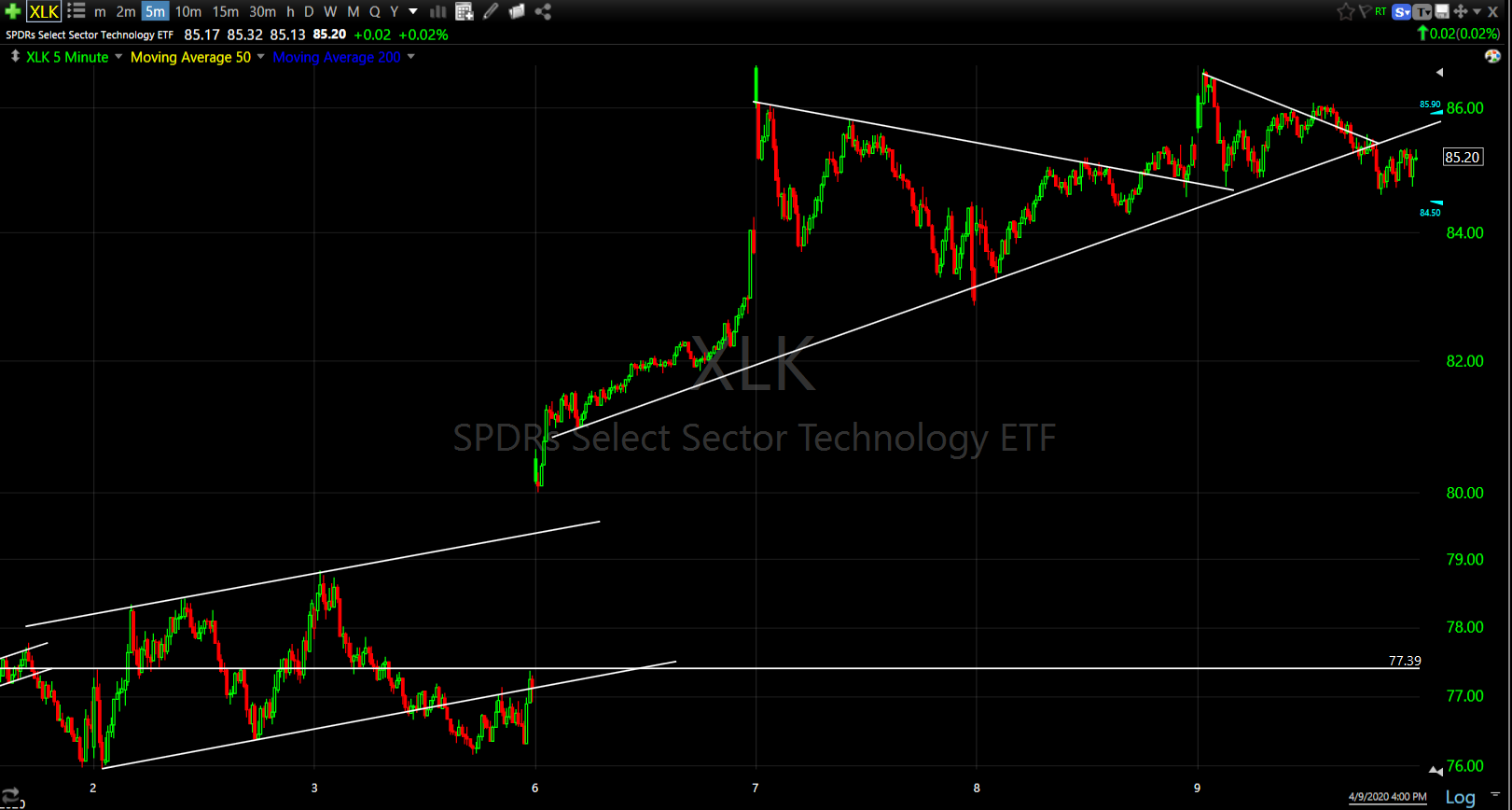
Technology sector (5m)
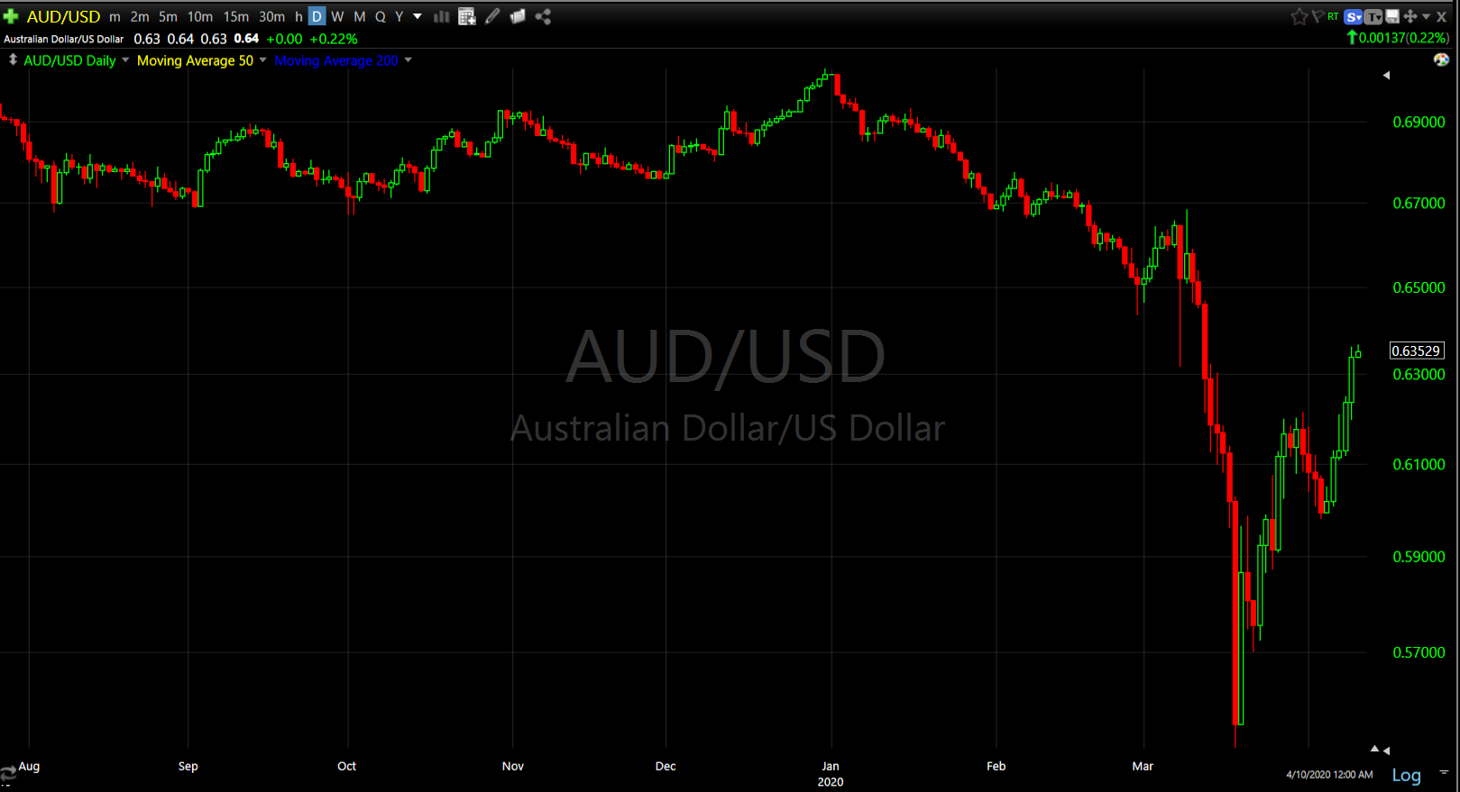
Market signals across various asset classes also ended the week bullishly, including credit as mentioned above. AUD/USD ended near the week’s high after bouncing off 0.60 last Sunday…
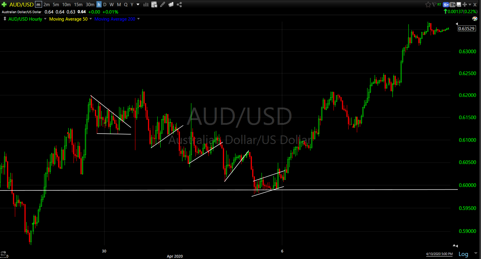
AUD/USD (60m)
With the Fed buying the bond market from Treasuries to junk debt, it wouldn’t be too surprising if volatility were pushed to currencies.
I did see the safe haven Japanese yen being conspicuously bid Thursday.
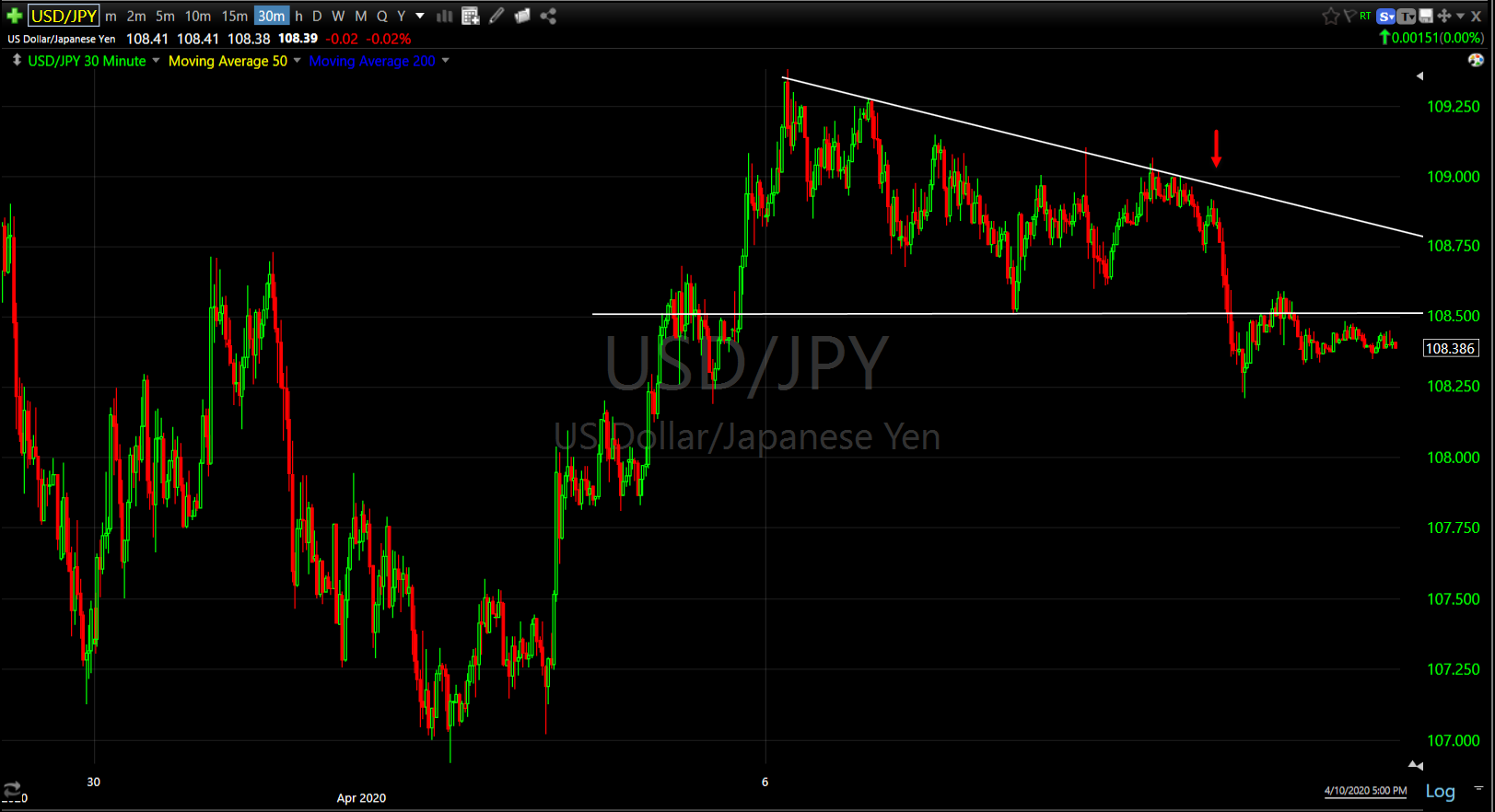 USD/JPY (30m)
And that was mirrored in 10-year yields as well.
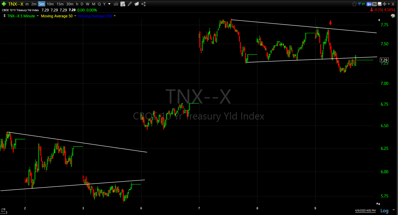
10-year yield (5m)
Volatility showed better relative performance this past week.
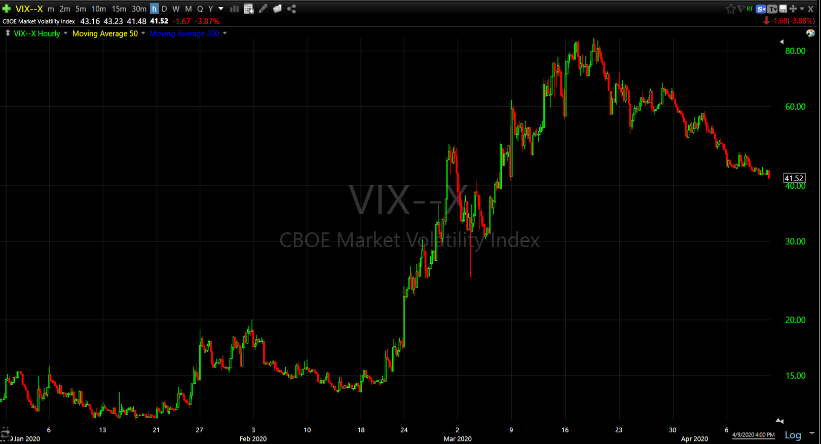
VIX (60m) is tracing out a bullish wedge with the price range tapering/narrowing. There were a couple of positive divergences in VXX last week, and some selling pressure before the FOMC minutes and Powell’s virtual statement Thursday morning. To me volatility looks more neutral as opposed to very weak the week before.
Keep in mind that these are counter-trend or bear market rallies.
AUD/USD (daily)
The S&P retraced 50% of its crash….
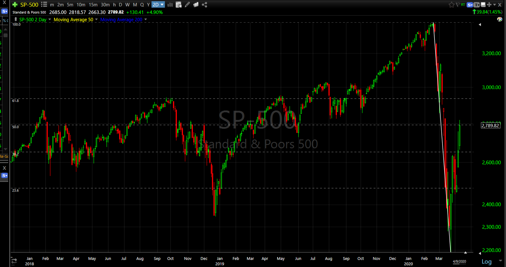 SP-500 (daily)
While the short-term market signals are still constructive, I did start a short in small caps at the end of last week. The week prior market signals looked worse, but the risk-reward for a short trade did not look favorable. Now market signals look decent, but the risk-reward of a short trade looks much better. Several times last week I mentioned “overhead supply” zones above. Small Caps is the best example…
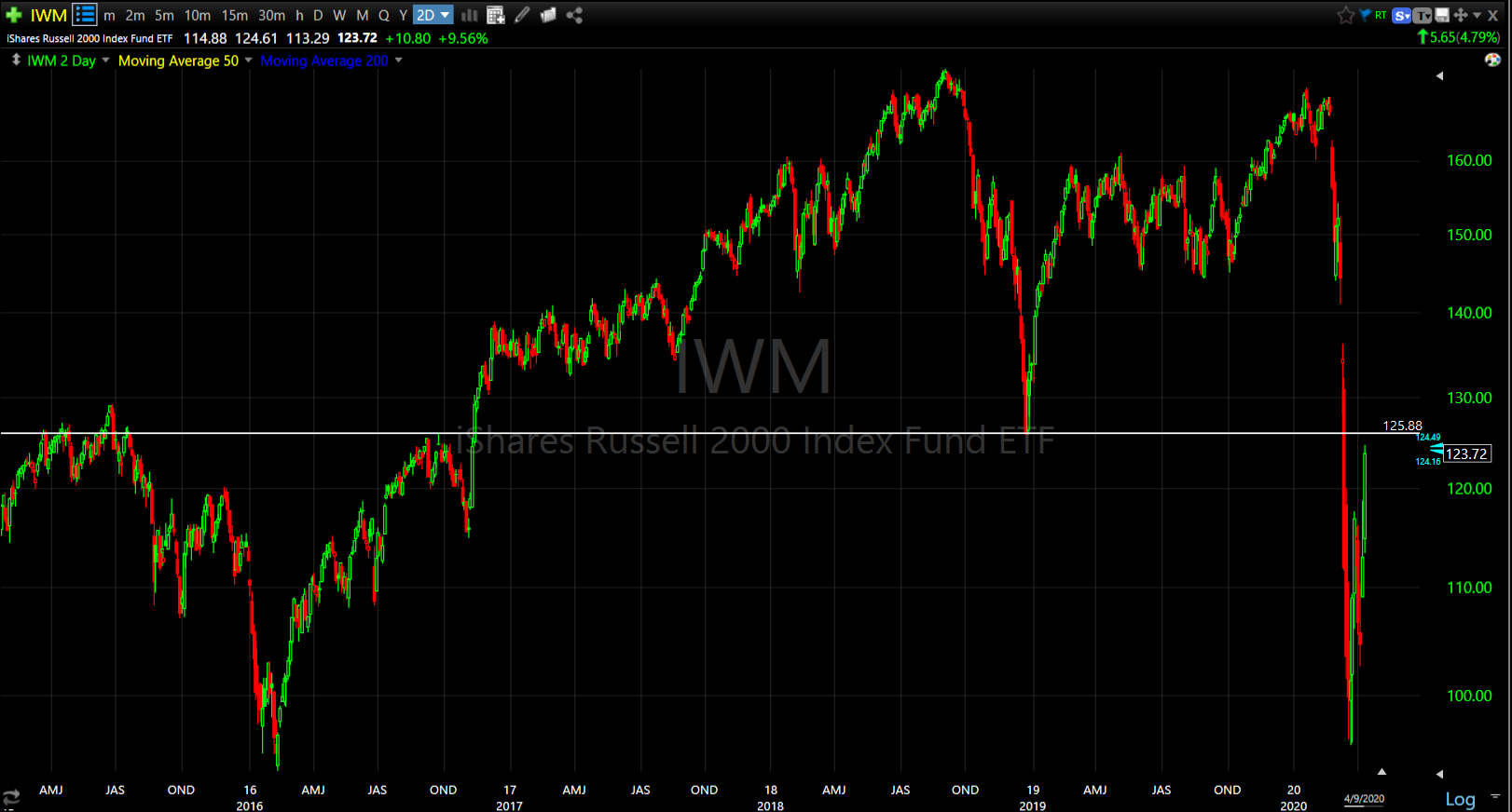 IWM (2-day)
I don’t view potential support and resistance levels as exact, but rather zones or areas. Imagine that you had bought IWM/Small Caps the last few years, then the market crashed. You would have probably had a lot of sleepless nights and swore a hundred times that if price would just get closer to where you bought, that you’d sell given the chance. That’s the idea behind overhead supply. A lot of buyers who went through a horrible experience with positions at higher levels now getting the chance to unload those positions. That’s the concept of overhead supply.
I started a short position here, but I’m not swinging for the fences yet. I am willing to take on a bigger position because the risk/reward looks far more favorable with small caps nearly 30% above their crash lows. For me to add to that position I want to see the market signal side of the equation turn toward higher probabilities as well. As we saw last week, things happen very fast in bear markets.
And finally, speaking of bear market rallies…
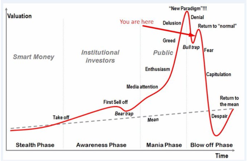 Denial and return to normal- how appropriate with the market pricing in a v-shaped recovery.
Does this look familiar?
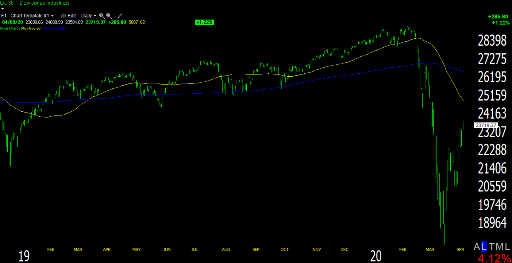 Dow (daily) with a 50-day (yellow) and 200-day (blue) simple moving average.
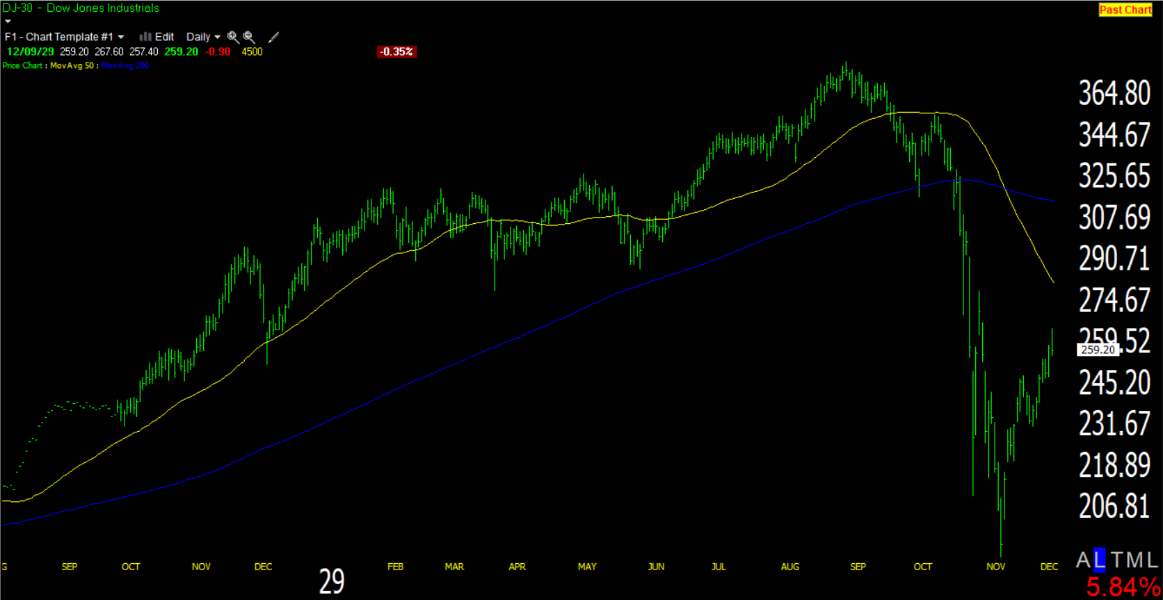
This is the Dow from 1929, about 3 weeks after the crash.
Here’s the rest of the context….
 Dow (daily)
I’m not suggesting that this market will be like 1929-1932, but I don’t think that the market has “priced-in” a global economic recession to the likes that no one alive has seen (one that may very well be a depression), in seven weeks.
Next week will kick off Q1 2020 earnings season starting with the banks. If there’s anything noteworthy happening in futures later tonight, I’ll send out an update. Enjoy the rest of your weekend!